Pages

Jul 30, 2012

Vintage Footstool with Freezer Paper Transfer

You know how last weekend was a sit around, do nothing all day, weekend? Well, this weekend was the complete opposite. I didn't sit still for a minute. Right from when I got home from work on Friday, I jumped into projects. And actually accomplished 5 or 6 things. I'm pretty proud of myself for getting so much done.

One of my favourite things was recovering a small footstool we have. This stool was a gift from my aunt and I use it all the time. It sits under my desk and I prop my feet up so that my legs are at a more comfortable angle. It's a cute stool, very padded, but the fabric colours don't suit my taste any more. So off with its head! No really, everything stayed in place and I just covered over it.

(Sneak peek)
Vintage Footstool with Freezer Paper Transfer


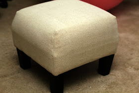
Here is the little sweetie before the facelift. The main colour is a yellow-tan with red and olive green stripes. As you can see, it's in really good shape and the top is very cushy.


I started by measuring up one side, across the top, and down the other side. All together it was 26" (adding a bit for the edges) so I cut a piece of pre-washed dropcloth into a big square 26 x 26. Do you use dropcloth as a fabric? I'm telling you, it's the best thing ever invented. The weave is tight, it can be dyed or printed on, and it's fairly water-resistant.

I draped the cloth over the stool, made sure it was centred, and pinned the corners down so that they fit tightly.


I then sewed along my pin lines and fitted the cloth back onto the stool.  It needed to be brought in a little bit at the bottom of each corner so I re-sewed the bottom half of each seam to be closer to the stool. Are you with me so far?

I then cut off the excess material on each corner, flipped the material right-side out, and pulled it back down onto the stool. You'll want it to fit very snugly. Now is the time to adjust your seams if you need to. You don't want to wait until you've started stapling and then realize it's too loose.

I removed the stool legs, and starting at a corner, folded over the material and stapled it down to the underside of the frame.


Most people recommend starting in the center of each side when you're stapling, but I was able to get it to lie flatter when I started at  the corners. Once all four corners were stapled down, I stapled along the sides, folding the material under to get a nice finished edge. I then screwed the legs back on.


Flip it over and see what you've got! Isn't that a beauty? I could have stopped there, but oh no, there was more fancify-ing to come!

I searched on the internet and found a graphic that I liked. It's a french style soap ad that may or may not be authentic. I saved the image, tinted it brown and increased the contrast, then flipped it in reverse. (PicMonkey is great for that if you don't have other editing software. I have Photoshop but for something like this I find PicMonkey faster.) I printed it on freezer paper, like I've shown you before, and then pressed the image onto the top of the stool and rubbed it all over with a flat object (in this case the side of the tape dispenser) to make sure it was evenly applied.

Vintage Footstool with Freezer Paper Transfer

You'll want to dampen the fabric first, but just slightly damp - if it's too wet your image will bleed into the fabric. Not all of the lettering is legible, but the main words are and that's good enough for me! Those kind of imperfections just make it look worn and original.

The sides seemed a little plain so I took a piece of brown satin ribbon, folded it in half lengthwise and sewed it together along the long side. I measured around the stool with the ribbon, marked where the two ends should meet and sewed them together. I then slid the ribbon down around the stool like an elastic band, making sure that the long seam was facing inside towards the stool and not showing. The seam that joins the ribbon ends will show, but if you wiggle the ribbon until that seam is on top of one of the corner seams no one will even notice. Did I say "seam" enough? Seam, seam, seam!

Vintage Footstool with Freezer Paper Transfer

And there you have it. Wasn't that simple? And now my stool has a new life. 

Vintage Footstool with Freezer Paper Transfer


Vintage Footstool with Freezer Paper Transfer


Vintage Footstool with Freezer Paper Transfer


Vintage Footstool with Freezer Paper Transfer


I'm linking up here this week!


Jul 27, 2012

Adorbs

No time for blogging today. Work was brutal - I found a huge mistake in my report (that I'd worked on all day) at 3:30pm today and had to fix it before leaving. It took until 5:15, and that was going at triple-speed. My mousing hand is still cramped.

I'll leave you with this cutie-pie - doesn't he just make you melt?


Have a great weekend!

Jul 26, 2012

Guinea Pig Games - Going for Gold

I know you'll probably want to throw things at me when you read this, but I'm not a big follower of the Olympics. I'll catch an event here and there, and I'll read recaps on the internet, but that's about the extent of my interest. I don't even own a sweatshirt commemorating the Olympics being held in my own country in 2010. Call me unpatriotic, I can take it.

However, I could be talked into buying one of these calendars. And I'm allergic to guinea pigs so that's saying a lot.


The Guinea Pig Games - Going for Gold calendar was created by Maverick Arts Publishing and was created using a combination of real guinea pig models and digital shenanigans. The guinea pigs were borrowed from Palace Piggies Rescue centre, and Maverick Arts provided them with a donation in exchange for their help. Paul Cocken is the image creator and retoucher.

The pictures are so sweet! Guinea pigs always look so shocked at what they're seeing. Like my grandma when my aunt accidentally rented Eddie Murphy's Raw for her.

 Let me show you a few of my favourites.
(all images from themaverickshop.com)

Swimming


Hurdles

Rhythmic Gymnastics

Synchronized Diving

Long Distance Running


Are you excited about the Olympics? What are your favourite events to watch? Will you watch them live no matter what time they air? Do you collect memorabilia?


Jul 23, 2012

Blue Light Special

This past weekend we decided to do absolutely nothing. How often do you do that? For us, almost never. There is always something waiting to be done.  But we ignored it all and just relaxed. Tom napped in the hammock for hours, and I read an entire book.

We did manage to fit one little project in though. Something just for fun. I had bought a large glass vase at Homesense a few weeks ago and Tom decided to turn it into a lantern for the deck.


I realized afterwards that no one took a picture of the vase before we started. If you can imagine no rope around the base, this is what it looked like in the store.


It's about 14 inches high and it gave the living room a much needed pop of colour. And then Tom swiped it. I guess I'll just have to buy another one, won't I, Tom?

We started by building a wooden base to give it stability. Tom drew two concentric circles on a scrap piece of wood and cut out the outside circle with the jigsaw.


He used the router to carve out the inner groove that the vase would fit into and a smaller circle in the centre for the light. I'm sure there is a more poetic way to describe this but it isn't coming to me right now.


I puttied the holes, sanded all of the edges, and then did my favourite finish - two coats of Minwax Jacobean stain, two coats of watered down beige paint, and then a coat of wax.  

The light is just a little flashlight. It has one centre light and four outside lights for different levels of brightness. We glued it into the center of the base to keep it steady.


While the glue was setting, I hot glued thick twine to the top (formerly the bottom) of the vase. The base is very rustic looking and the top needed something to balance it out.

It's pretty cute, right? The edge of the vase fits tightly into the groove in the base, yet it easily slides out to turn the light on and off.


Some wicker and starfish to give it a nautical edge.


We waited around for dark to take some more shots. Unfortunately the mosquitoes were so bad that I could only get a few. And my arms ended up with a dozen bites anyway.


Tom is so proud of this one. We paid $14 for the vase and $5 for the light. Everything else we already had. So less than $20 all together. How much do you think it would cost in a store? 


I'm kind of proud of it, too!

~~~~~

I'm linking up here this week!


Jul 19, 2012

Main/Guest Bathroom Redo (and Redo Again)

Raise your hand if you've decided to paint a room spur of the moment. Now how many ran right out and bought the paint and did it? Keep your hand up if you then decided you didn't like it and painted the room again the next weekend. Am I the only one with my hand up now? I hope not.

But that's exactly what happened. I told you previously about buying the oops paint and starting on the main bathroom. Let me break down the rest of it for you.

I'll refresh your memory with a picture of the bathroom before we moved in. There was a whole lot of turquoise goin' on.


I tore out the medicine cabinet, the towel rack and the toilet paper holder, spackled, and got to painting.

Here is the first version.


I love the paint colour, I really do. But it just wasn't right. Part of it is because the room is small and has no window so it seems dark. Trust me, in this picture it looks far lighter than it really is. And part of it is the blue counter top. It looks kind of grey in this picture but it is very blue. Almost navy blue. 

This wasn't a gut job, and replacing the vanity isn't at the top of the to-do list, so we had to work with what we had. And taupe wasn't working with the blue. It does as an accent colour, but this blue is very overwhelming. Plus I wanted to decorate in greens (had already bought the shower curtain and the artwork), so it just ended up a big ol' mess.


Last Friday night (please don't sing) I decided I wanted a light grey-blue wall instead. With white accents and the blue countertop it would be perfect, right?


I made Tom take everything down off the walls again and I got to painting again. I think I'm finally ready to show you the result. Remember that there is no natural light source so the pictures aren't terrific.


The colour is Behr's "Reflecting Pool". And yeah, it looks white doesn't it? Hmmm, there may be some more painting in my future. But I'm going to think about it for a while first. Plus I'd like to move on from spending all my time in this room.


Details:


I had Tom build a new - bigger! better! woodener! (not a word) - medicine cabinet for me.


I put him through so much with this thing. I changed the size, I changed the bottom. And then when it was done he dropped it on the garage floor while he was drilling pilot holes for the wall screws. I'll admit I cried. He had to rebuild the doors and I had to repaint the handles. But it's all good now. I'll write a separate post showing how it was built and finished.


One thing I needed was a place to hang my "tools". I found these knobs at Home Depot and I love how matte they are. Originally the board was part of the cabinet, but I had Tom cut it off and hang it a couple of inches lower. It had sides before but I think this gives it a cleaner profile.


I've shown it with just the hair dryer hanging but this is what it really looks like day to day. So much better than piled up on the door handle!


The entire room is done in oil rubbed bronze-esque tones, though they aren't all matchy-matchy. 


The medicine cabinet handles are from Lee Valley. They were spray painted with two coats of anodized bronze and one coat of oil rubbed bronze (after the little cabinet mishap). That way there is complete coverage with just a little bit of sparkle.


I even painted the soap dispenser. Thanks to House of Hepworths for this idea. I don't have a Cricut or Silhouette so I tried painting on an S, but it didn't turn out. So I sprayed over it. I kind of like how you can still see the S ever so slightly.


Tom also built a frame for the mirror that is routed on both the inside and outside edges. I finished it to match the cabinet and it is a thing of beauty. Our first mirror frame was very plain compared to this one. 


It makes the mirror look huge. And hopefully makes the room look bigger also. The best part is that it was made completely from scrap wood so it cost $0.00!

Some little touches -

a chippy basket for extra rolls of paper


extra towels and bath salts


baskets for makeup and nail polish


The shower curtain is a twin flat sheet that I hemmed to floor length. I found a dark bronze shower curtain rod and matching ring clips. I love that with these clips you're no longer limited to traditional shower curtains.


I found a painting that has all of the colours of the shower curtain in it, but in circles instead of stripes. When there is more time I'm going to have Tom build a frame for it to give it more presence. 

(Who messed up my towel?)


That's it for today's bathroom tour. How about a before and after?


Please tell me someone else has gone through this much hassle to get the room they wanted?


~~~~~

I'm linking up here this week!