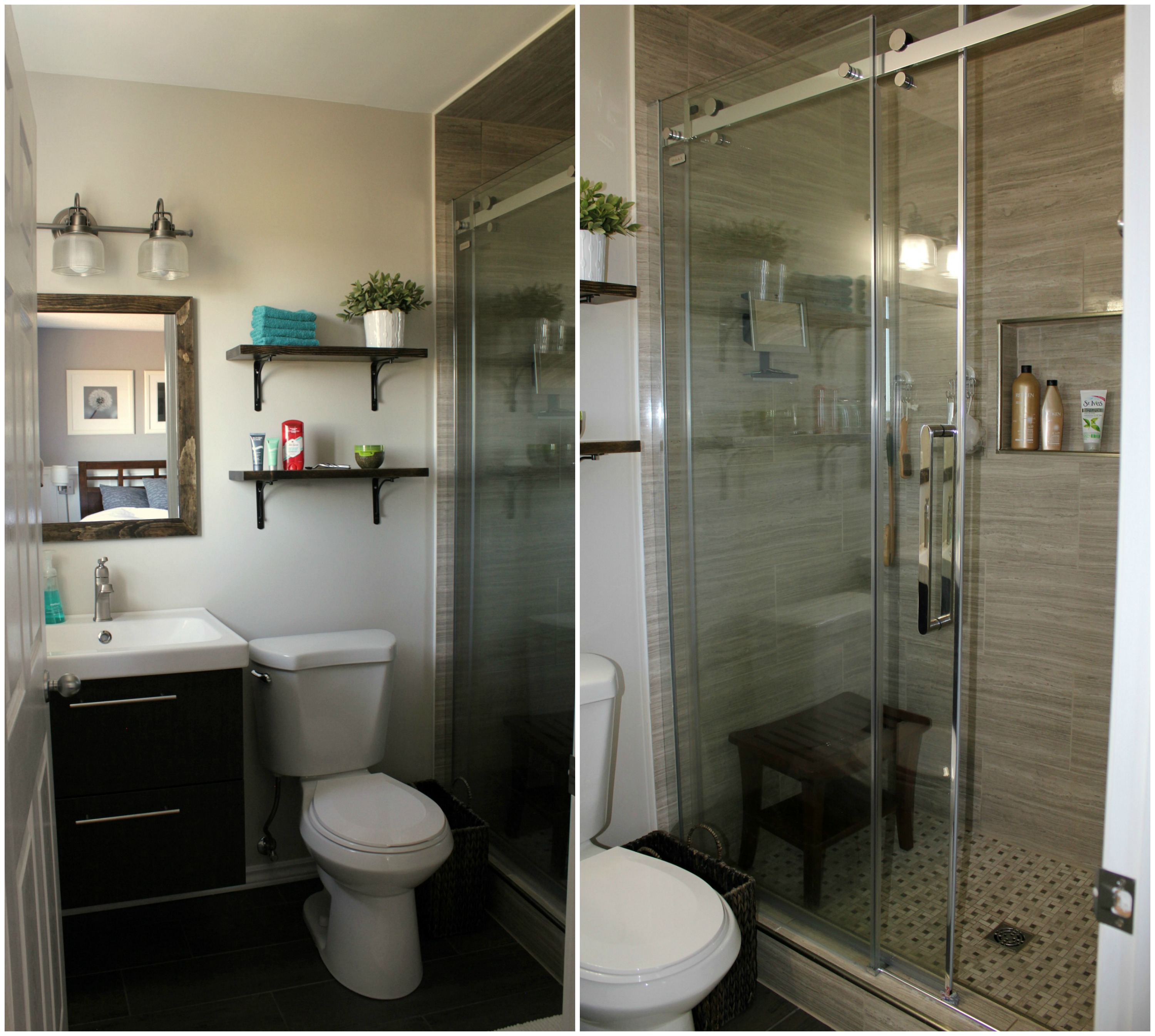
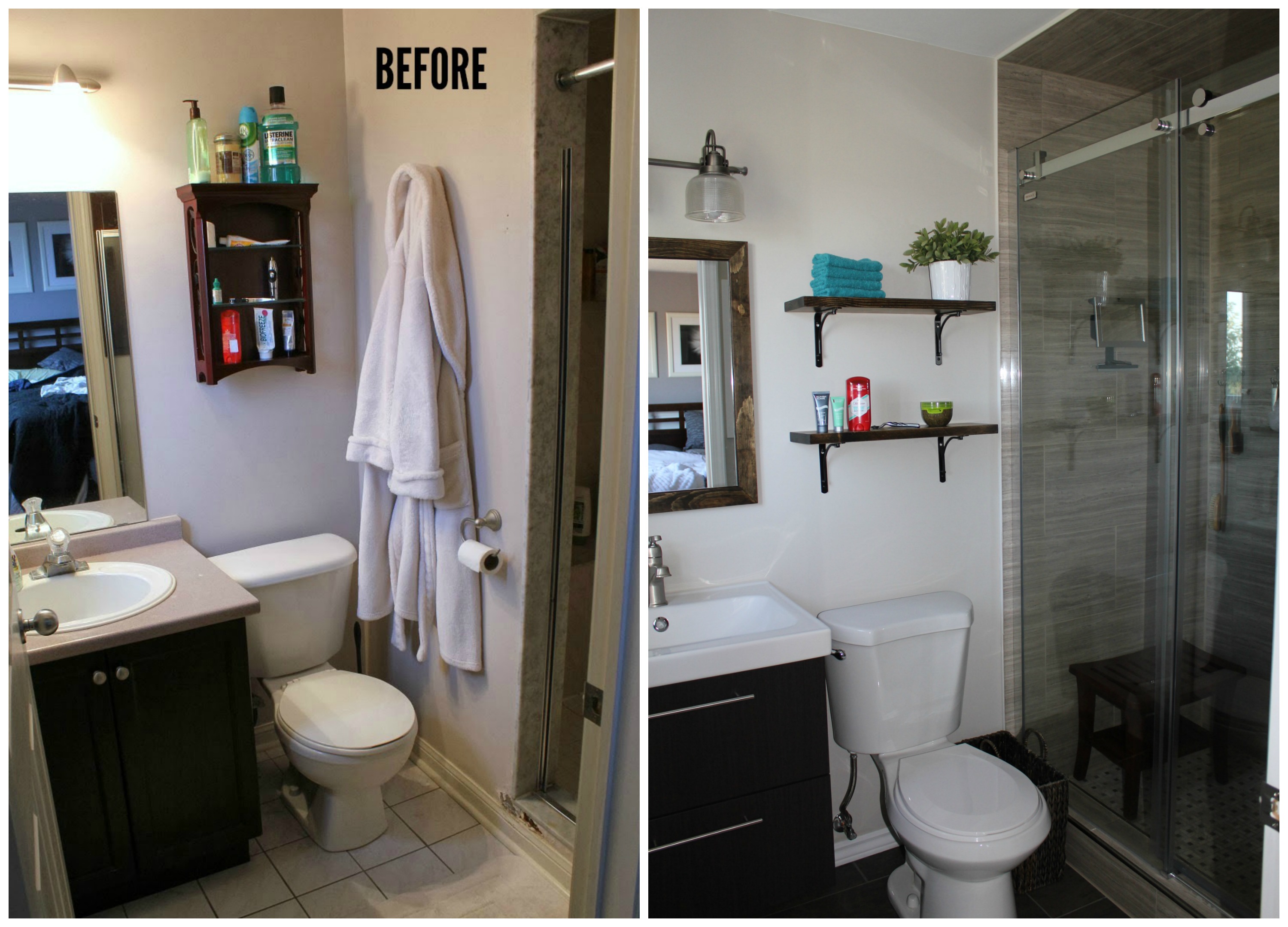
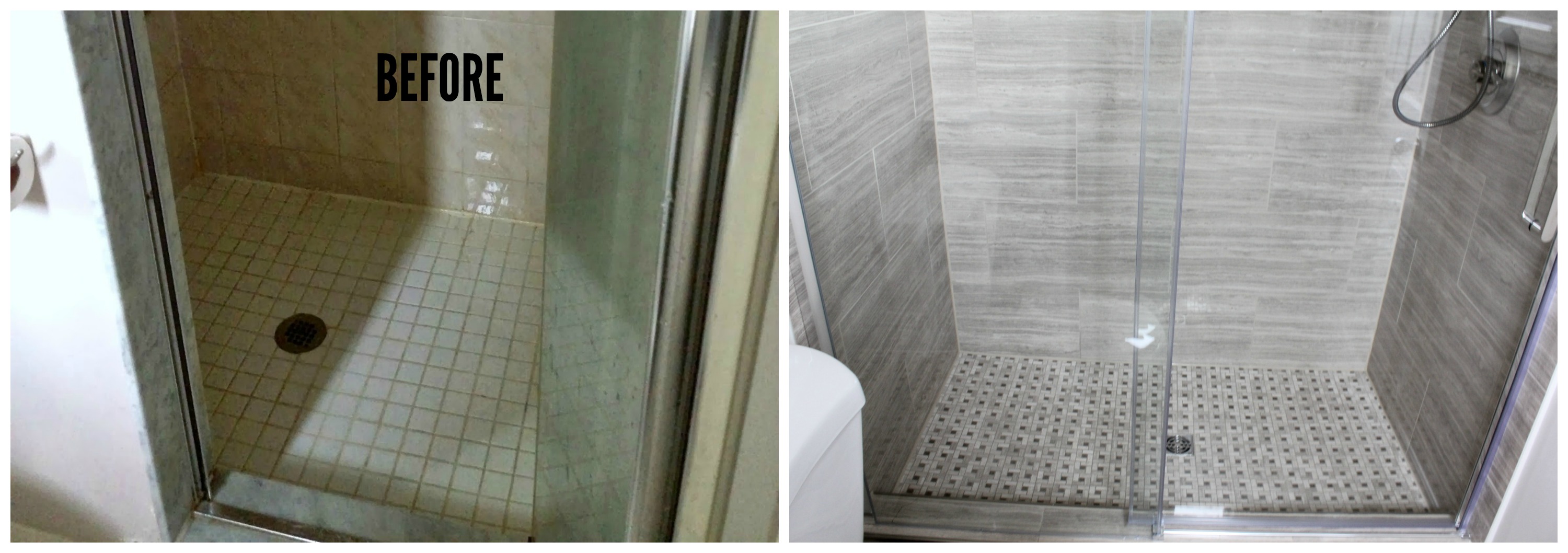
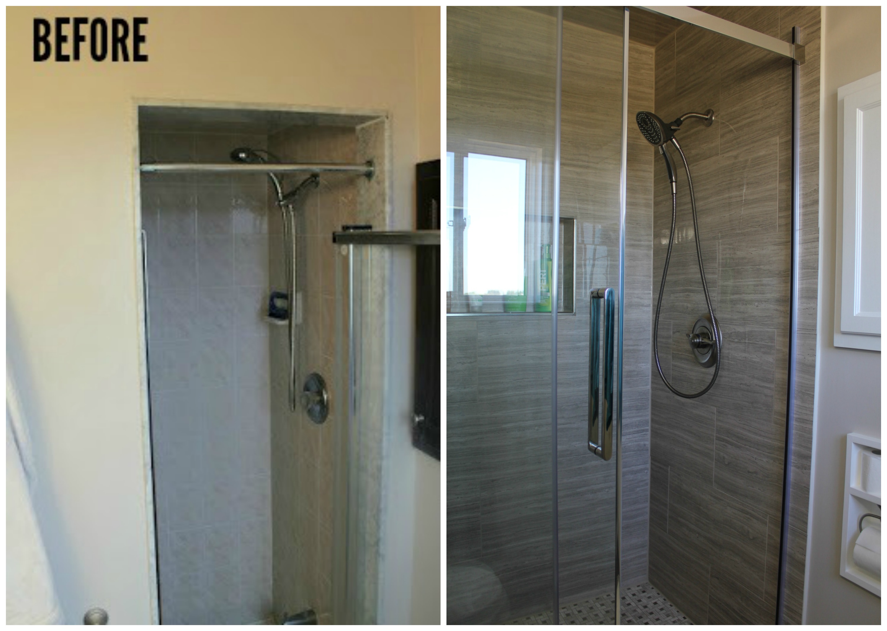
Do you remember what it looked like before? Take a look back here from when we gutted it and prepared for the tilers to make it pretty again. It was a sad, little box - a box that was falling apart. The water damage around the shower door was so bad that the drywall was flaking off, and the shower itself felt like a cave.
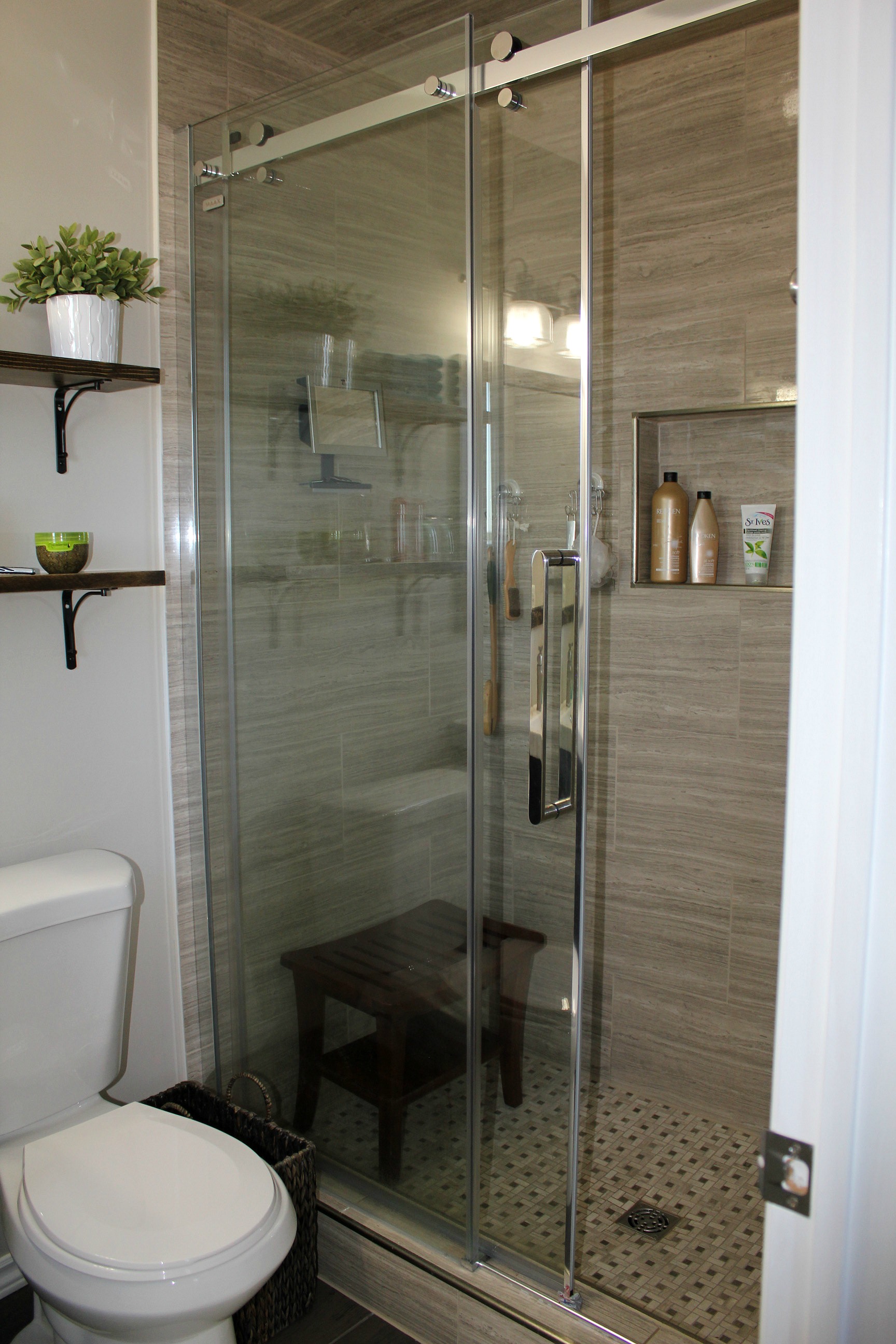
But not anymore! Instead of shielding your eyes from all the ugly and hurrying out, now it's a place you want to spend time in.
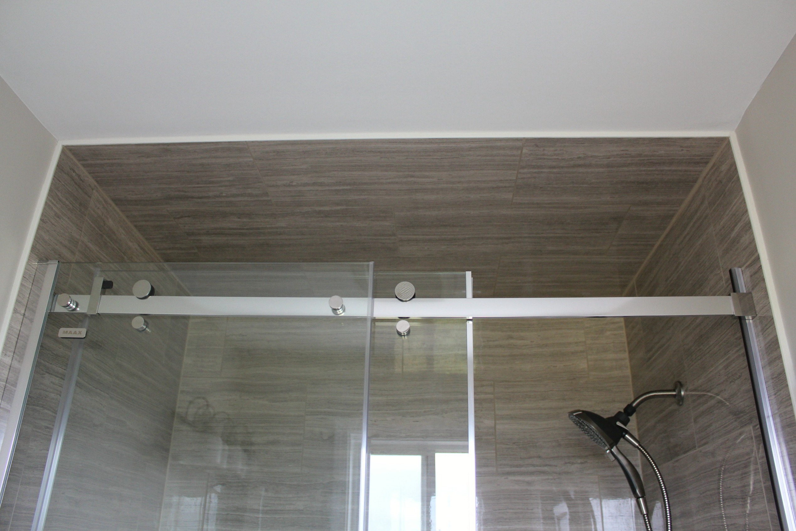
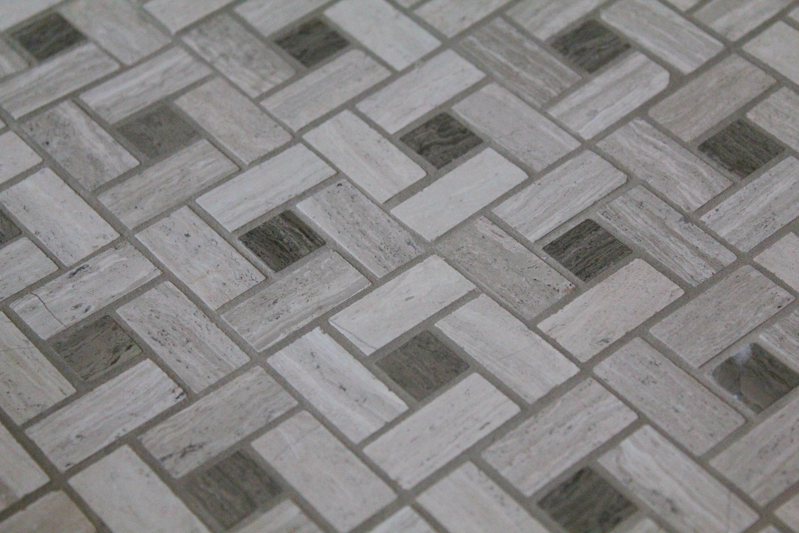
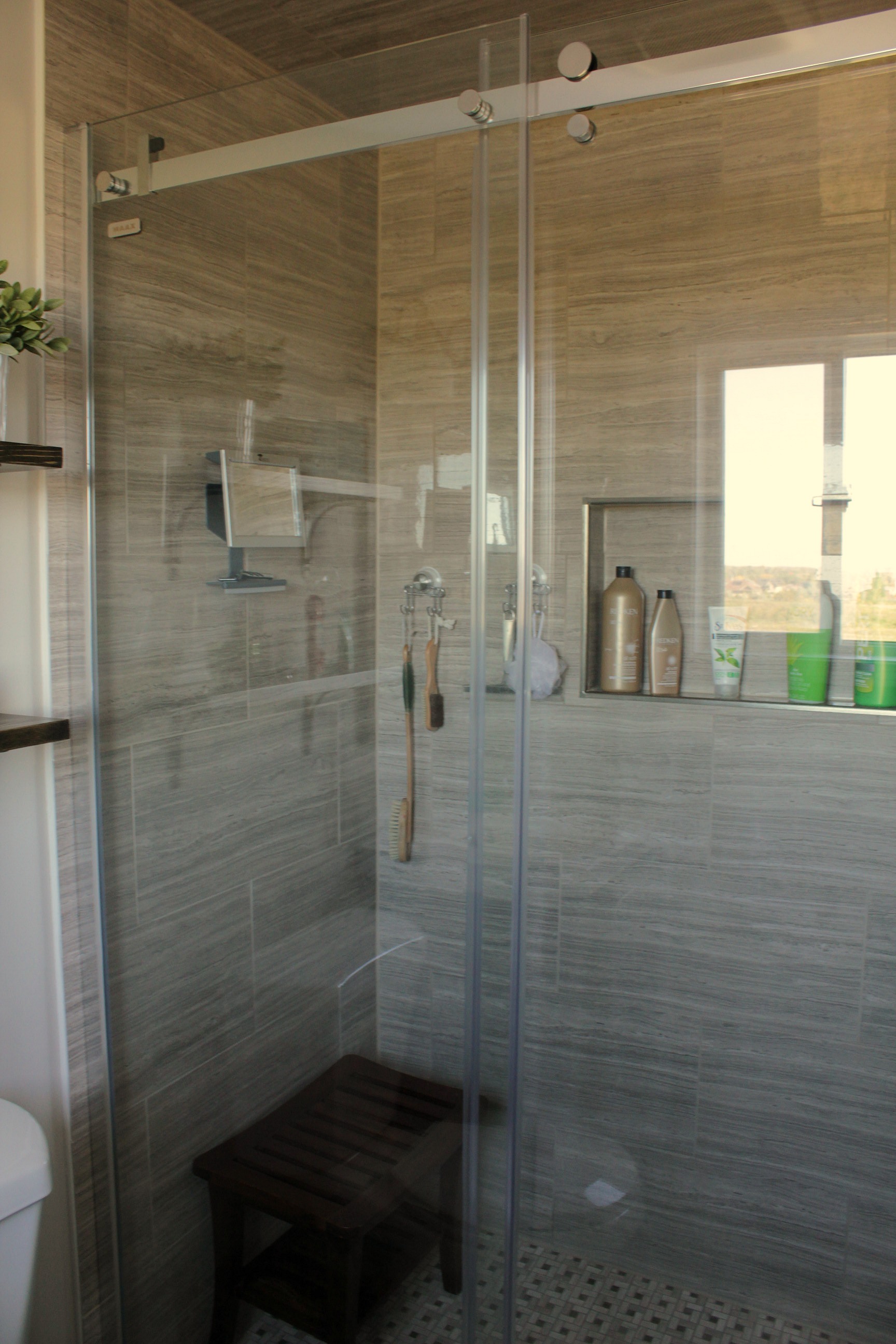
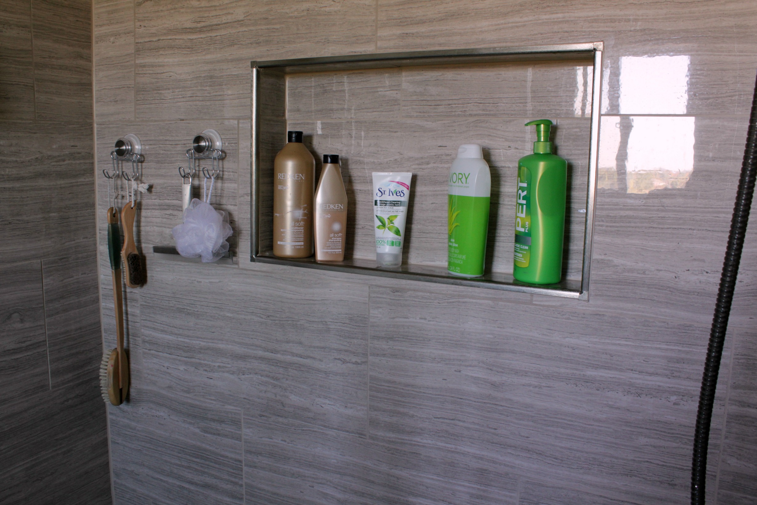
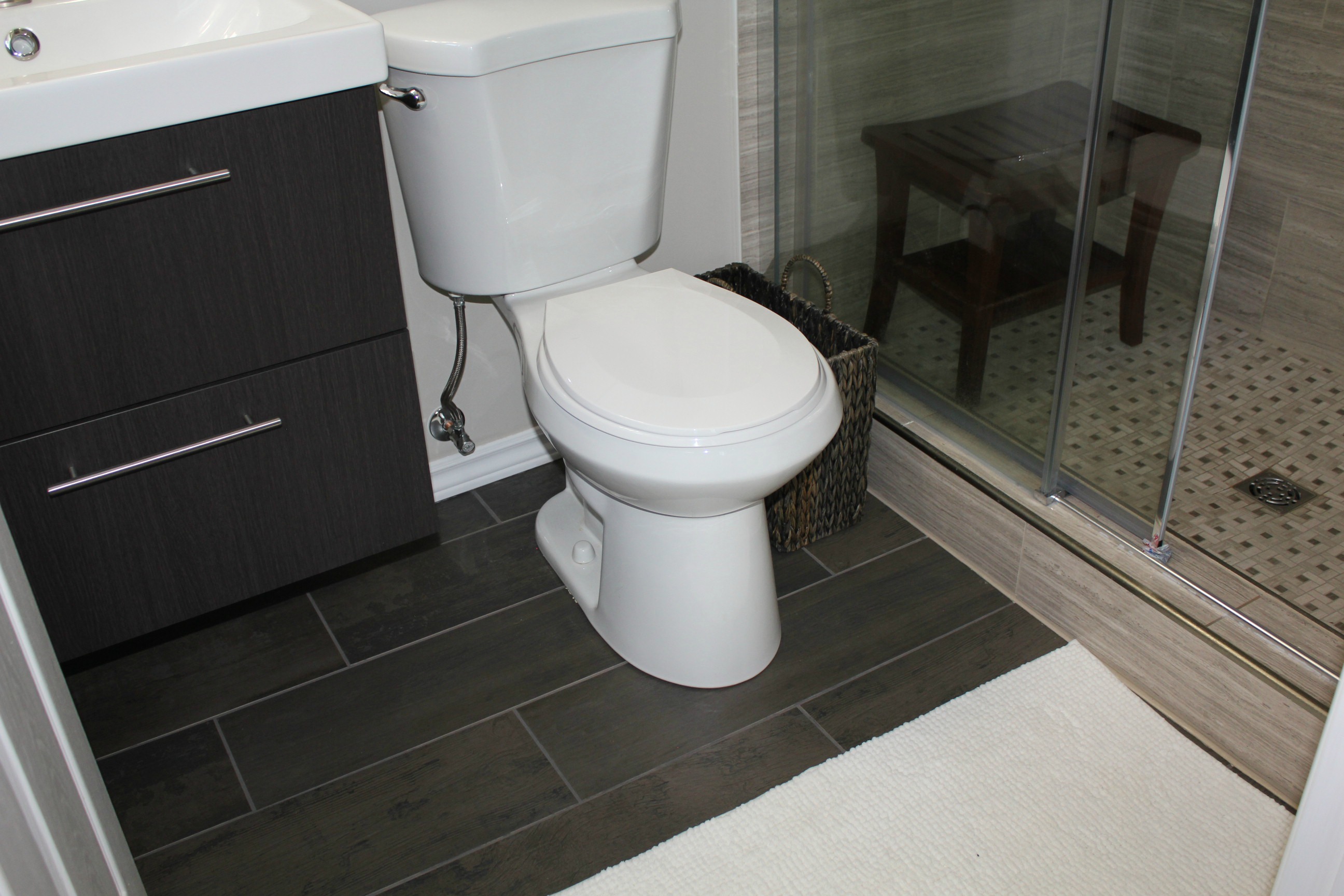
The old shower had a built-in bench which was convenient, but it took up a lot of space. We decided against replacing it and added a small teak bench instead - for those important leg-shaving moments. We also built a niche in the back wall to hold shampoo/body wash bottles. I love the streamlined look of the whole space. I'm not sure it's any bigger, but it feels twice the size.
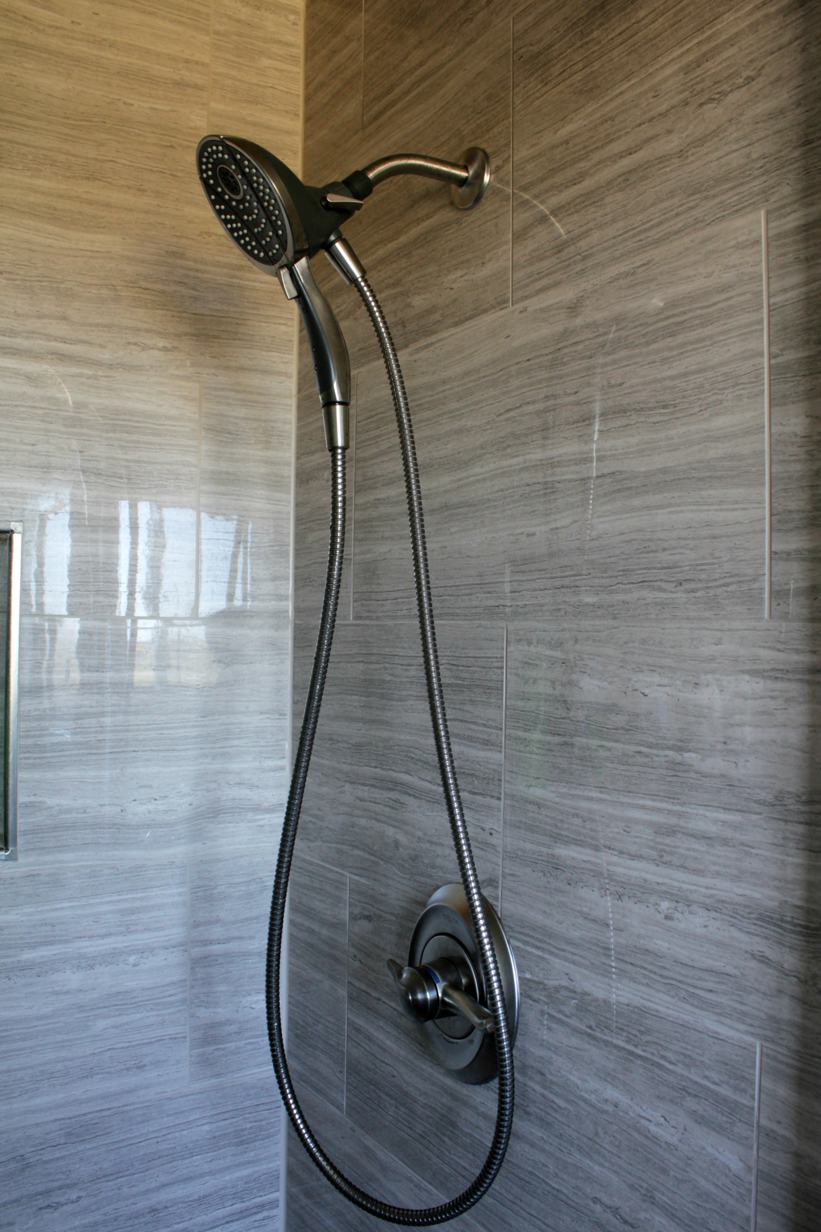
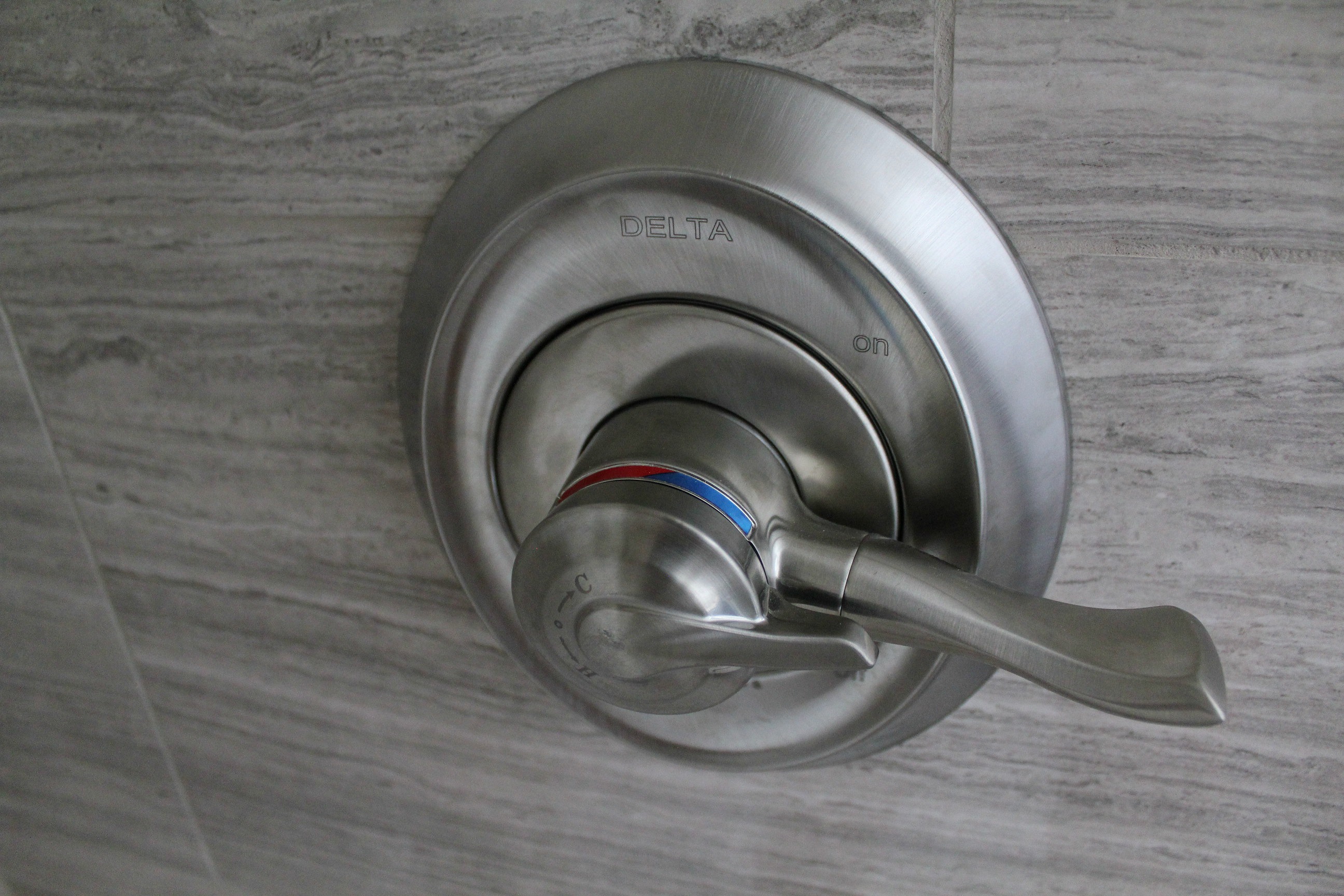
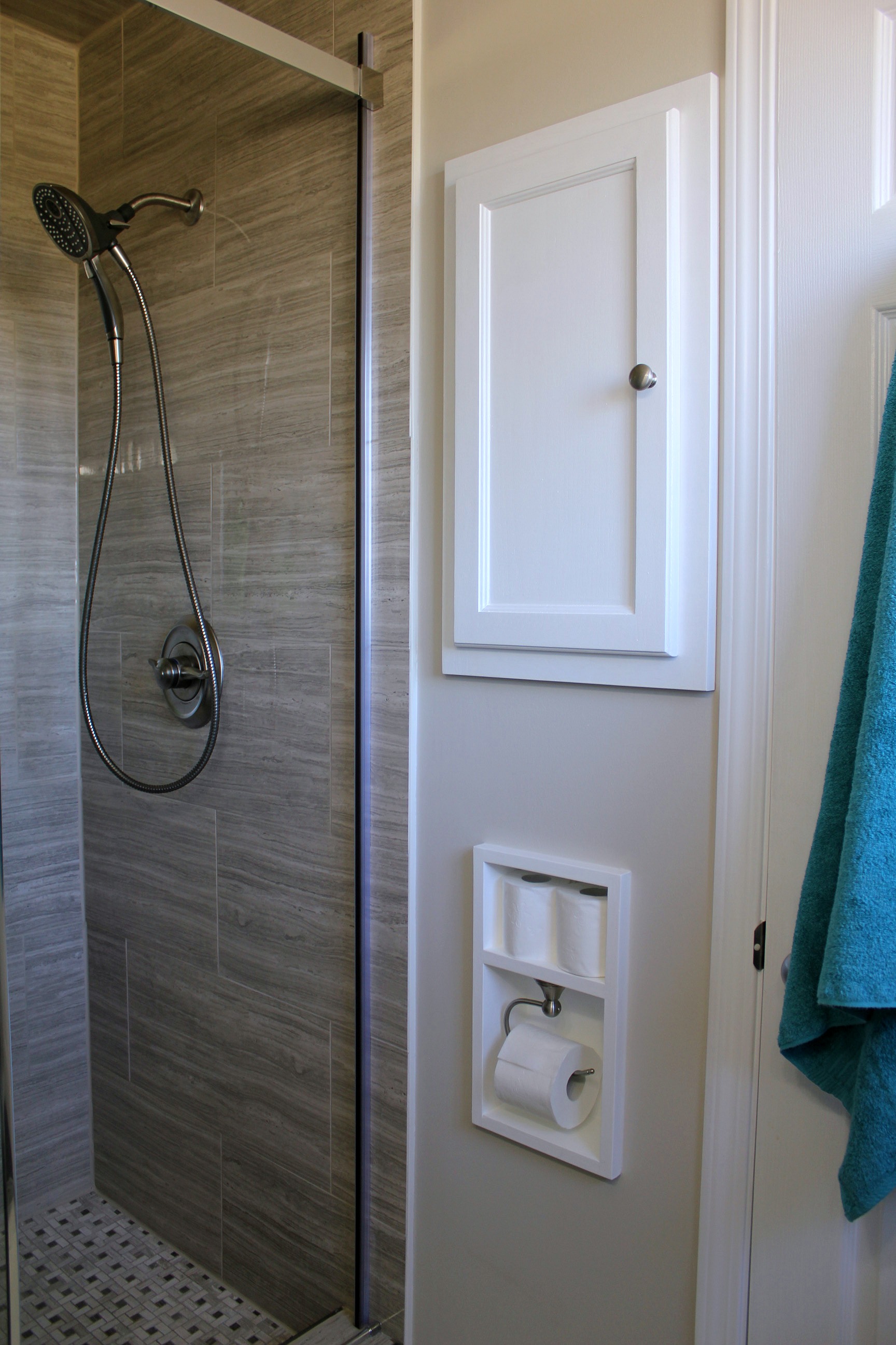
Now comes the really cool part. The water controls have two levers - you set your temperature with the smaller inside lever and then just turn the larger lever each day and you have the perfect temperature every time. Nice when you're stumbling in first thing in the morning with your eyes only half open!
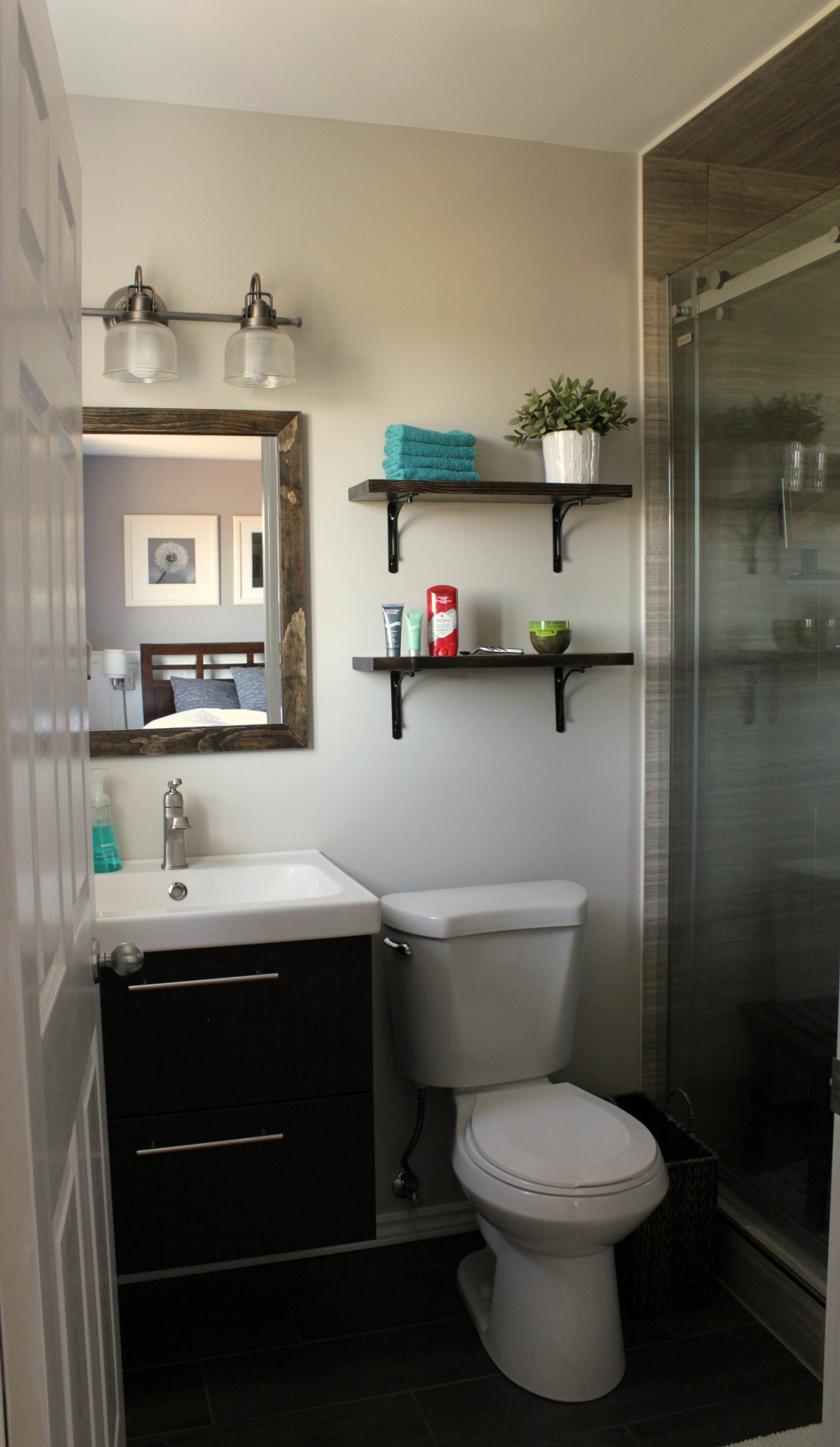
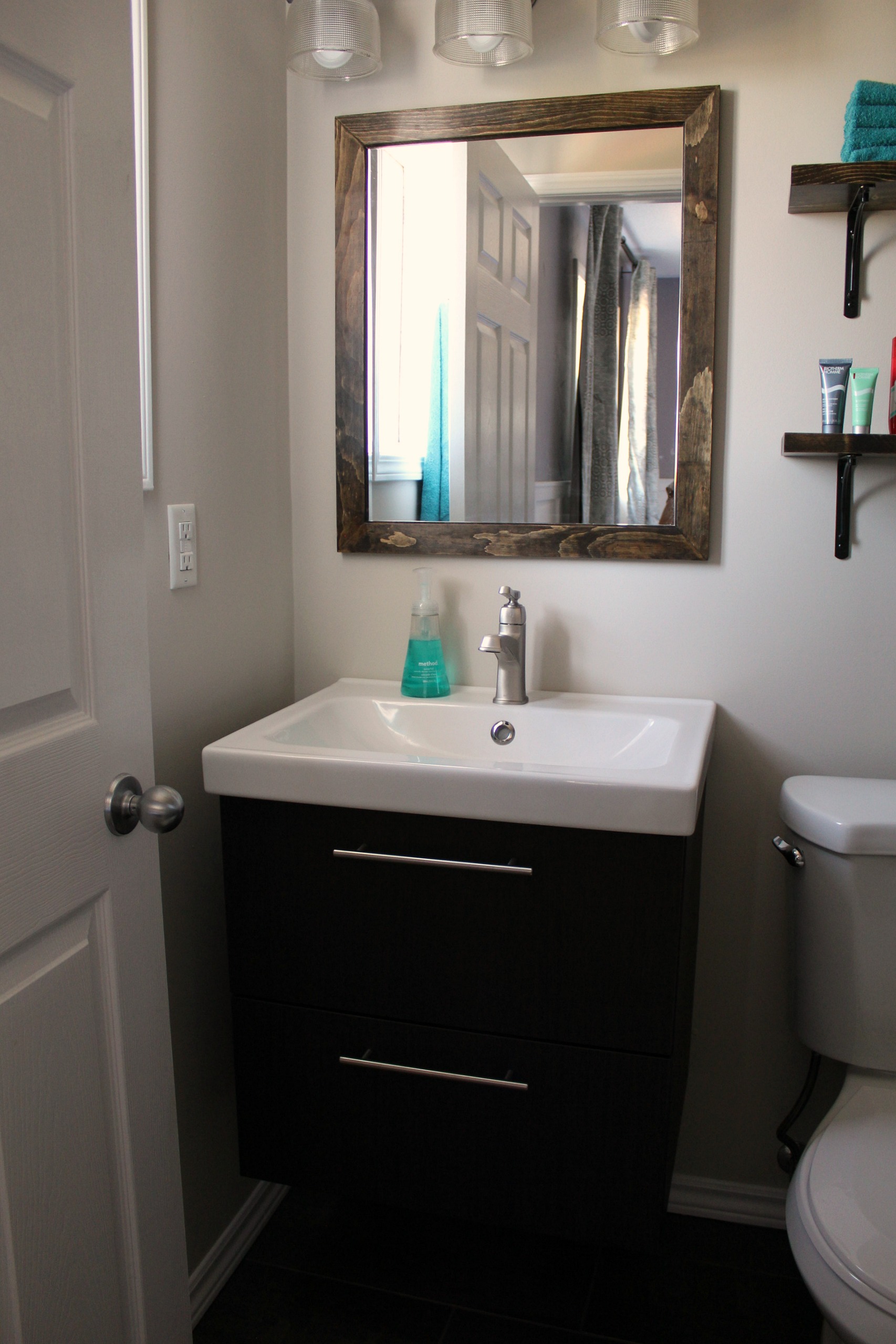
The smaller one fits the space better and there is still plenty of room in the drawers for everything. But now we have this extra vanity. We're either going to sell the bigger one or we might keep it for when we renovate the main bathroom - whenever that happens. We replaced the handles that came with the vanity with brushed nickel rod-type handles from Home Depot.
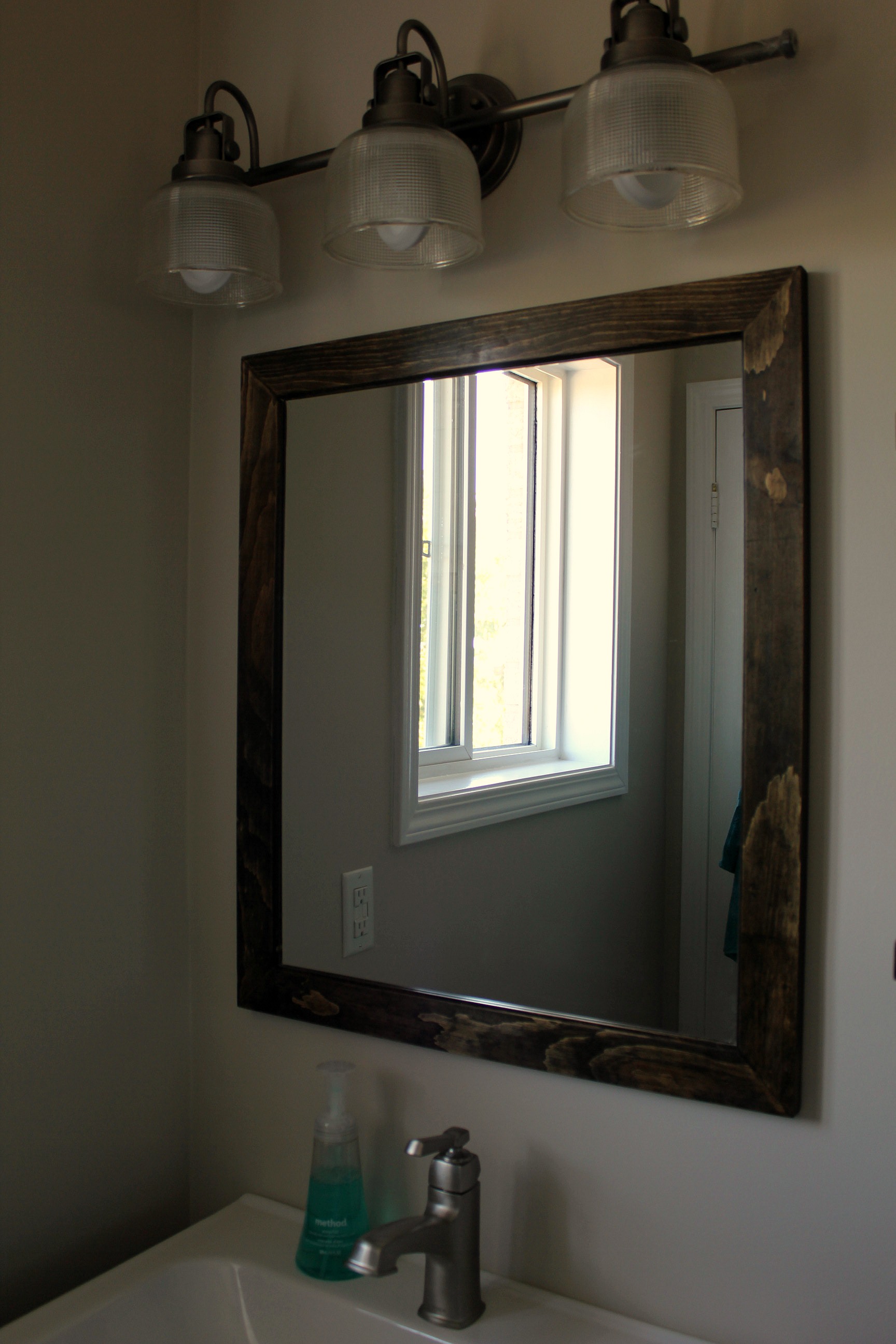
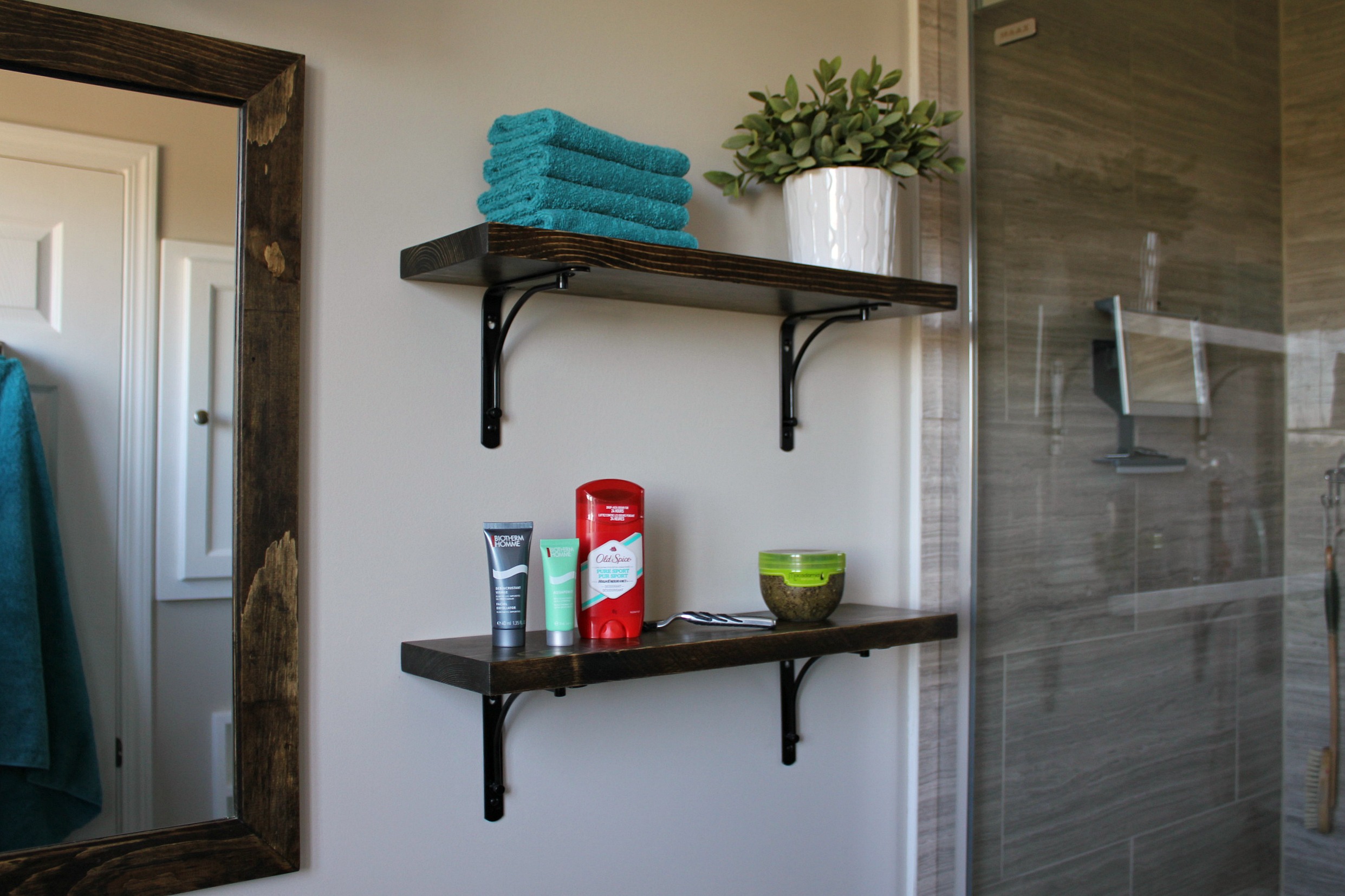
The mirror above the vanity is custom-made. Tom wanted the vanity hung a little higher than normal, which meant the old mirror was too big to fit between the lights and the sink. We looked all around but couldn't find a mirror the right size, with a real wood frame, that was a price we were willing to pay. So we bought an unframed 20"x24" mirror and built the frame ourselves! The inside edges of the frame are routed with a groove so the mirror slides right into place and won't fall out. I stained the frame with Minwax stain in Jacobean brown and gave it two coats of wax, buffed with steel wool.
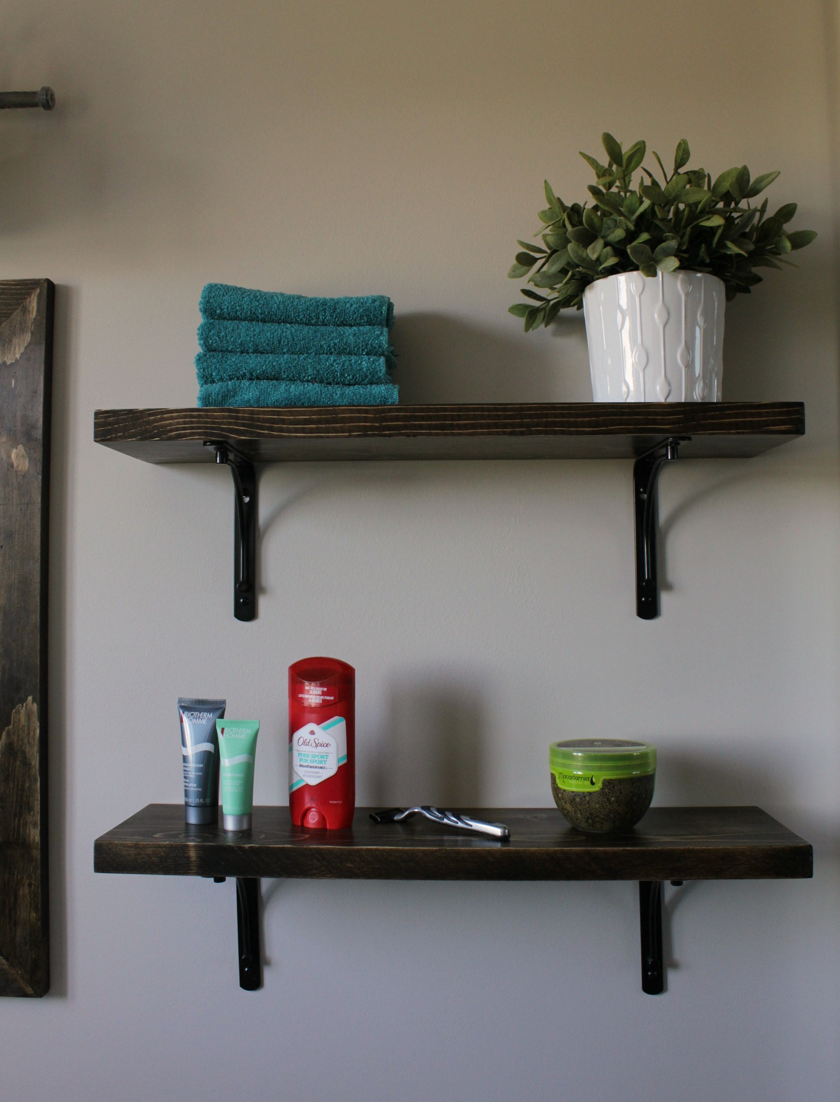
The shelves beside the mirror are made from 2"x10" boards planed down. I gave them the same stain/wax/buff treatment as the mirror frame. So smooth. We decided on shelving rather than a cabinet to continue with the light and open feeling of the room.
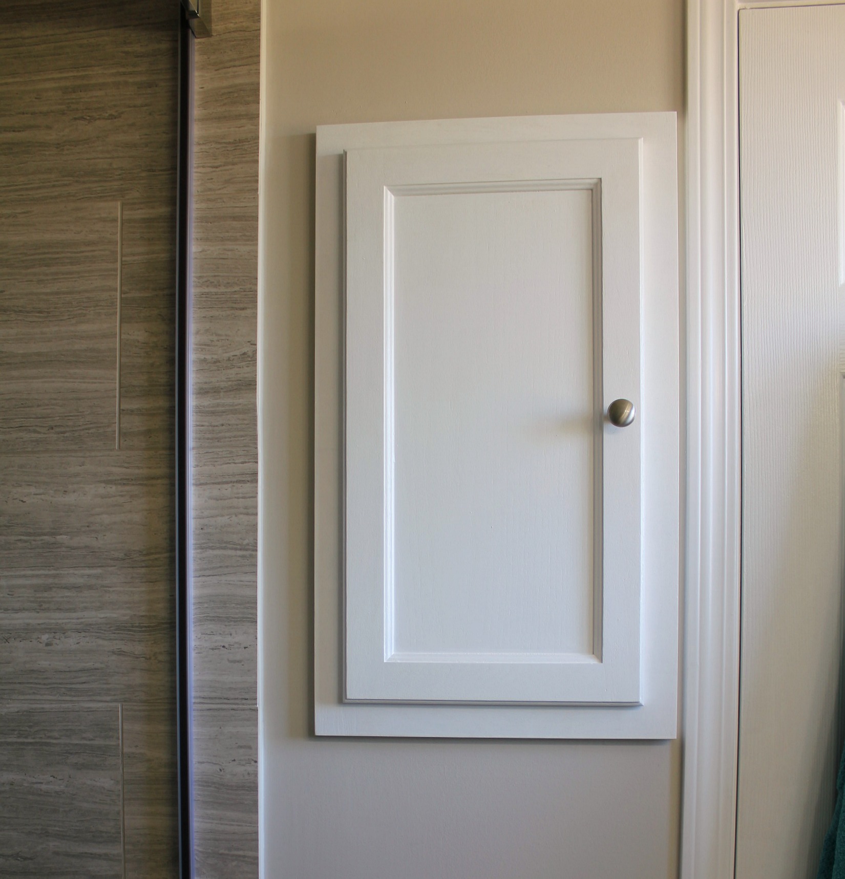
On the other side of the room is a built-in medicine cabinet. It was stained dark brown before, but I thought that the room needed more white to balance out the dark floors, vanity, and shelves. The only other thing we did to change it was to move the doorknob from the bottom corner of the door to the middle. Makes more sense, don't you think?
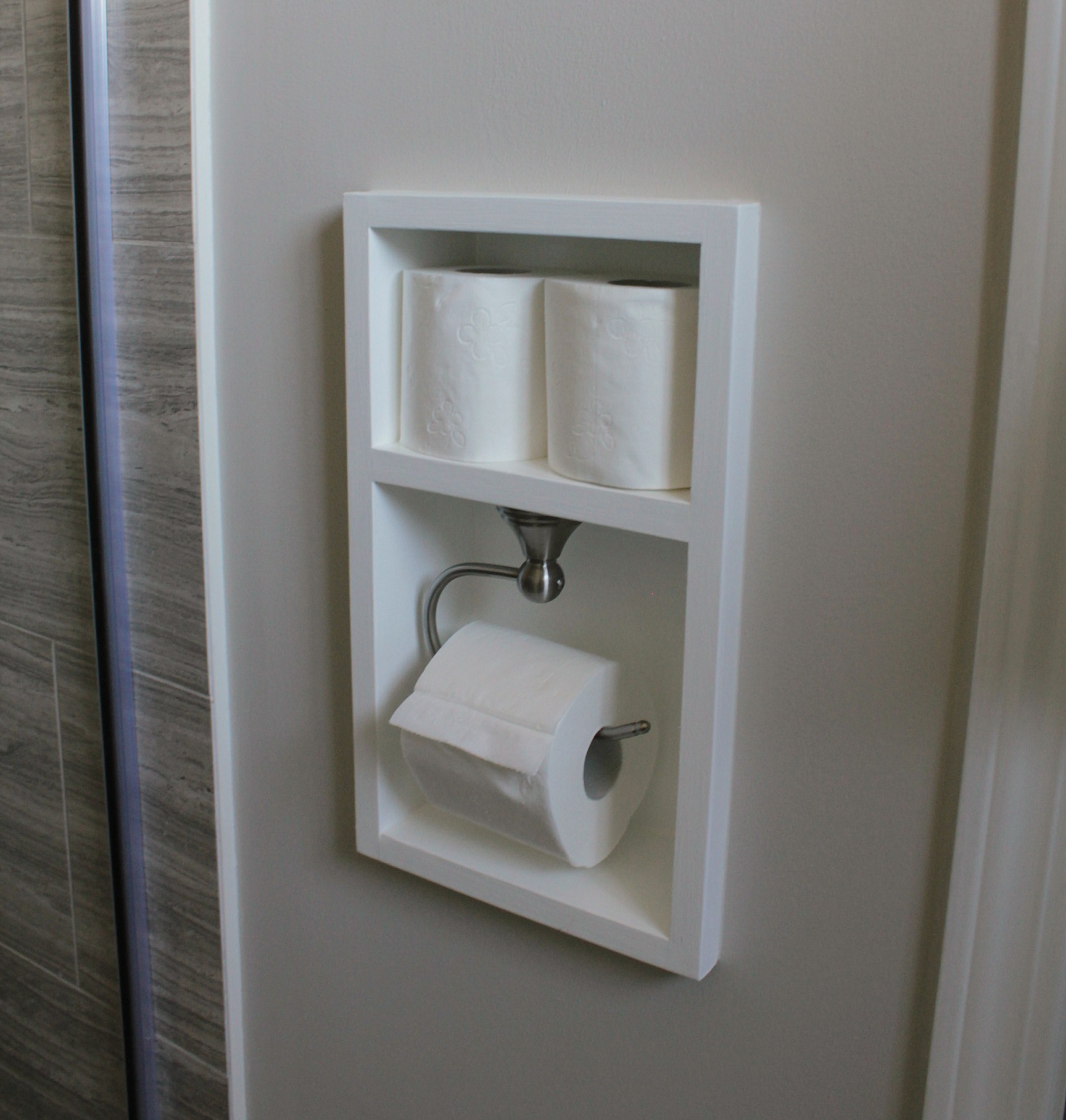
Below the medicine cabinet is the recessed, built-in toilet paper holder. Tom designed this. I think it's his favourite thing in the room. There are only a few places we could put a holder - on the side of the vanity (too close), on a floor stand (Tom was very much opposed to this), or on the wall across from the toilet.
This last one was the best option, but he was still concerned that we would bump into it if it stuck out from the wall. So he built an inset box from 1"x6" boards. He planed down the boards but left a lip all around the front to frame it. There's a shelf that runs across the middle to store spare rolls of toilet paper, and the roll holder mounts to the underside of the shelf. A couple of coats of primer and white semi-gloss paint finished it off. (Moen Preston toilet roll holder in brushed nickel.)
Go here for a complete how-to.
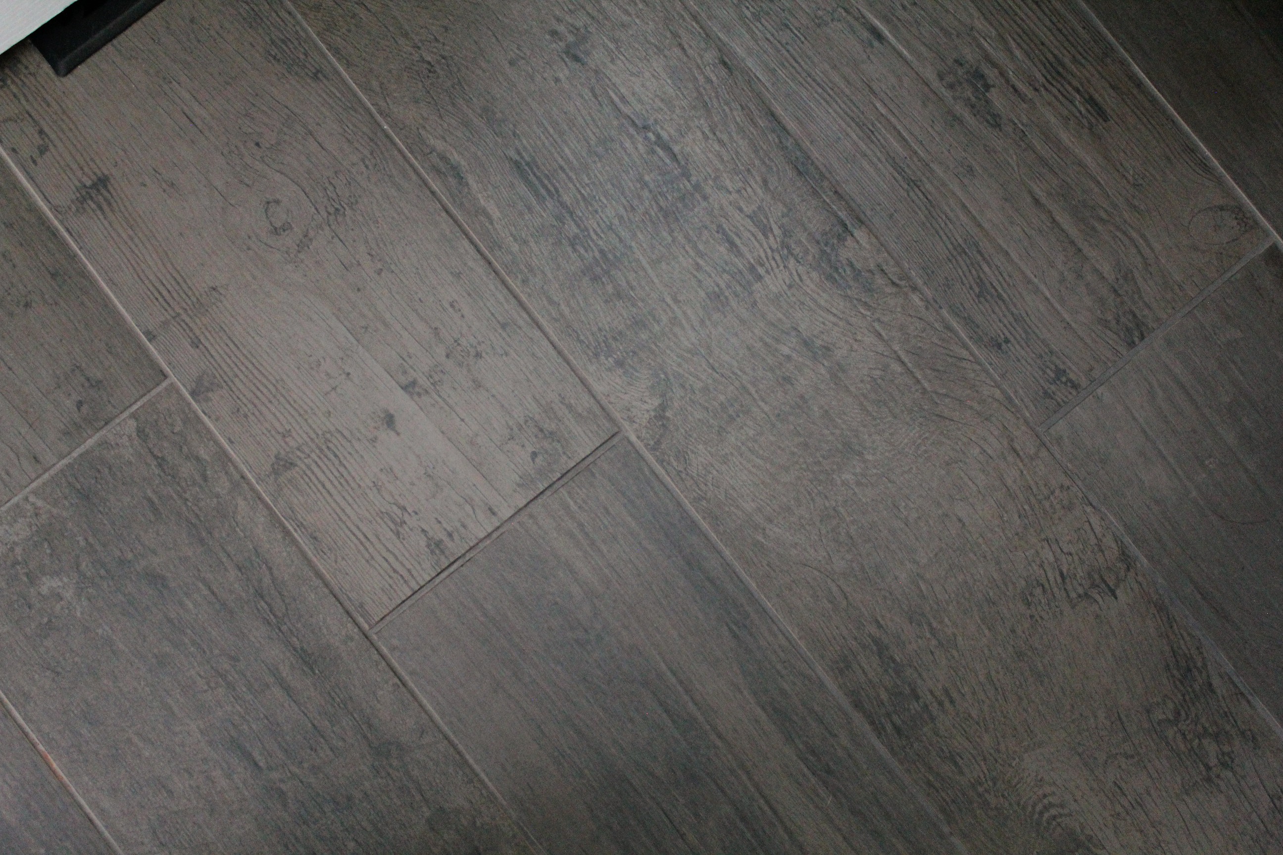
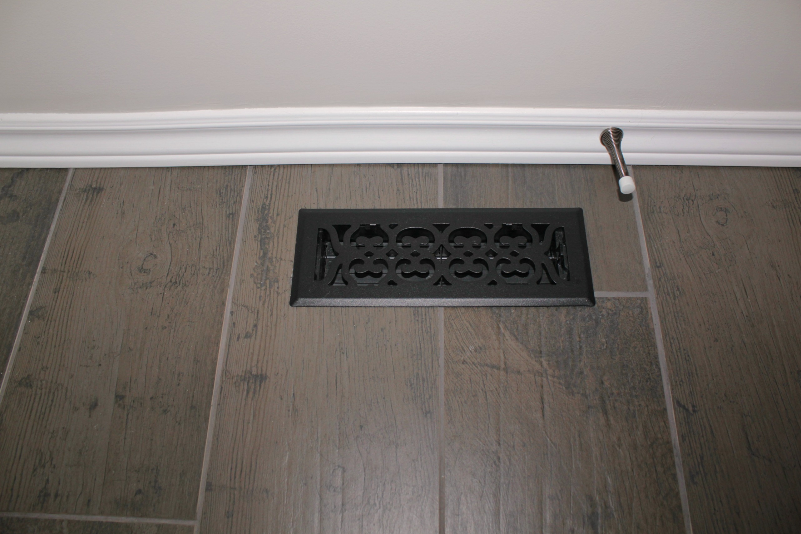
I can't forget to mention the flooring in the main area. We chose dark brown 8"x36" plank tiles that look like hardwood. I love this floor so much! The tiles have a slight texture like hand-scrapped boards and there are slight colour variations to add to the natural wood look. We even replaced the floor vent. Upgrades for everyone!
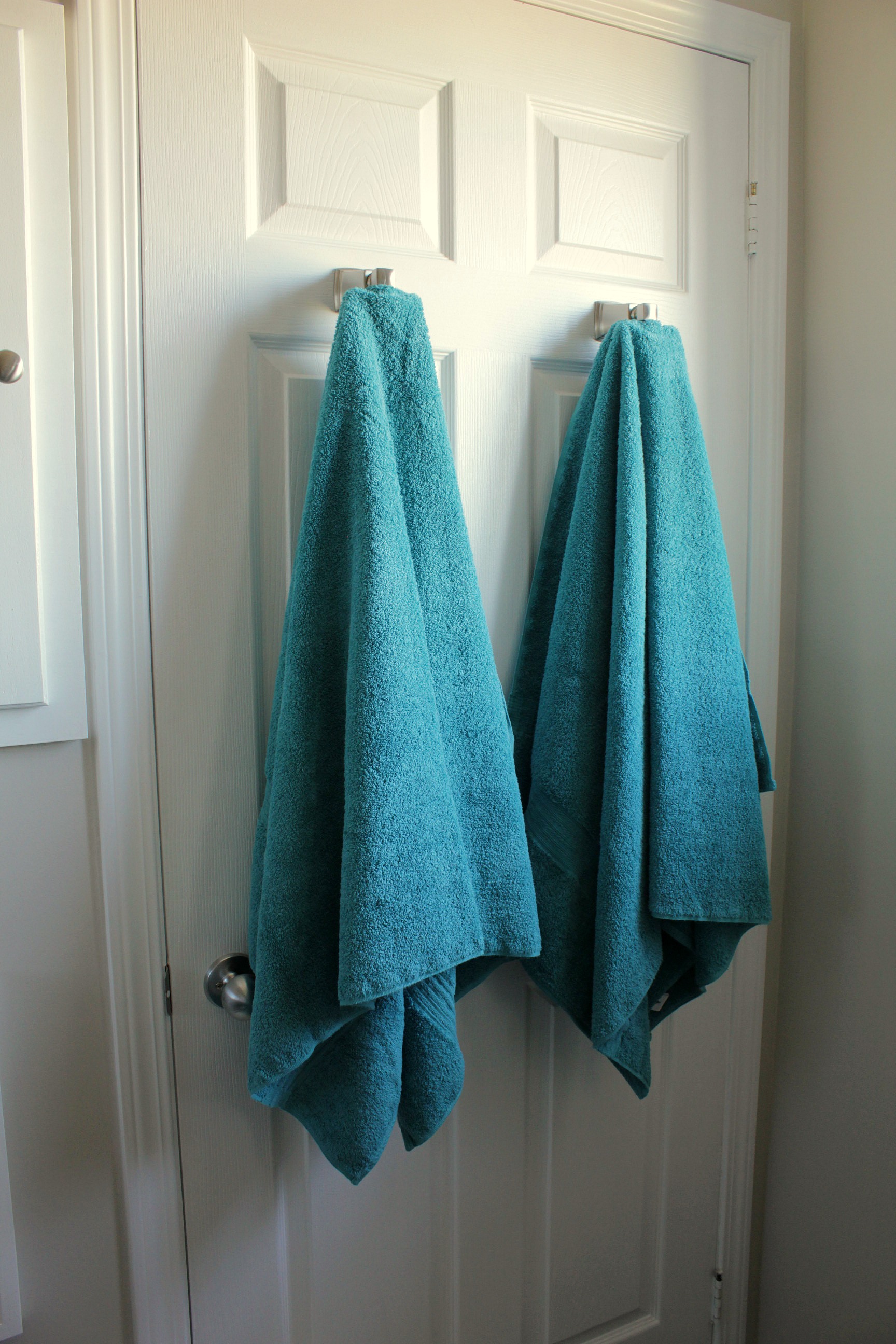
I chose teal and white as accent colours for the room. We bought new fluffy towels and facecloths to offset the white accessories. Even the hand soap coordinates - and that one was purely accidental. Since the bathroom is never used by guests, we decided to forgo a towel bar and just hang our bath towels on the back of the door. A cozy bathmat from Ikea finishes it off.
How about a few before and after shots?
********
Travel back in time to see the whole process -
Bathroom Reno - Demolition
Bathroom Reno - Plumbing and Insulation
Bathroom Reno - Shower Installation
Bathroom Reno - Tiling



Wow! That looks AMAZING! I love what you guys did. My favorite part is the custom mirror and shelving- the wood tones are just so beautiful in that space.
ReplyDeleteI just love it so much. How I wish we could redo our bathroom like this. You did a fabulous job and your husband is handy like mine I think. Found you on Kathewithane today
ReplyDeleteThank you so much, Sue! We are really enjoying our new bathroom!
ReplyDeleteThanks, Mikalah. The shelves are my favourite too - well, next to the wall tile anyway!
ReplyDeleteThis is a lovely makeover! Love the shower tile and the bigger space. I really like all the gray, brown and white scheme. Okay, I actually really like that toilet paper holder. lol Too clever! :D
ReplyDeleteOh, Wow! Gorgeous! Thank you for sharing. You are one of the features at the Make it Pretty Monday party at The Dedicated House. Here is the link to this week's party. http://www.thededicatedhouse.com/2014/10/make-it-pretty-monday-week-117.html Hope to see you again at the bash! Toodles, Kathryn @TheDedicatedHouse
ReplyDeleteThank you, Kathryn!
ReplyDeleteThank you!
ReplyDeleteBeautiful Reno! Where did you find the shower bench?
ReplyDeleteHi Shelly, the bench is from Bed Bath & Beyond. It's a small teak bench that I hope will be able to withstand being hit by water several times a day. We've had it for about 6 months now and it's still going strong!
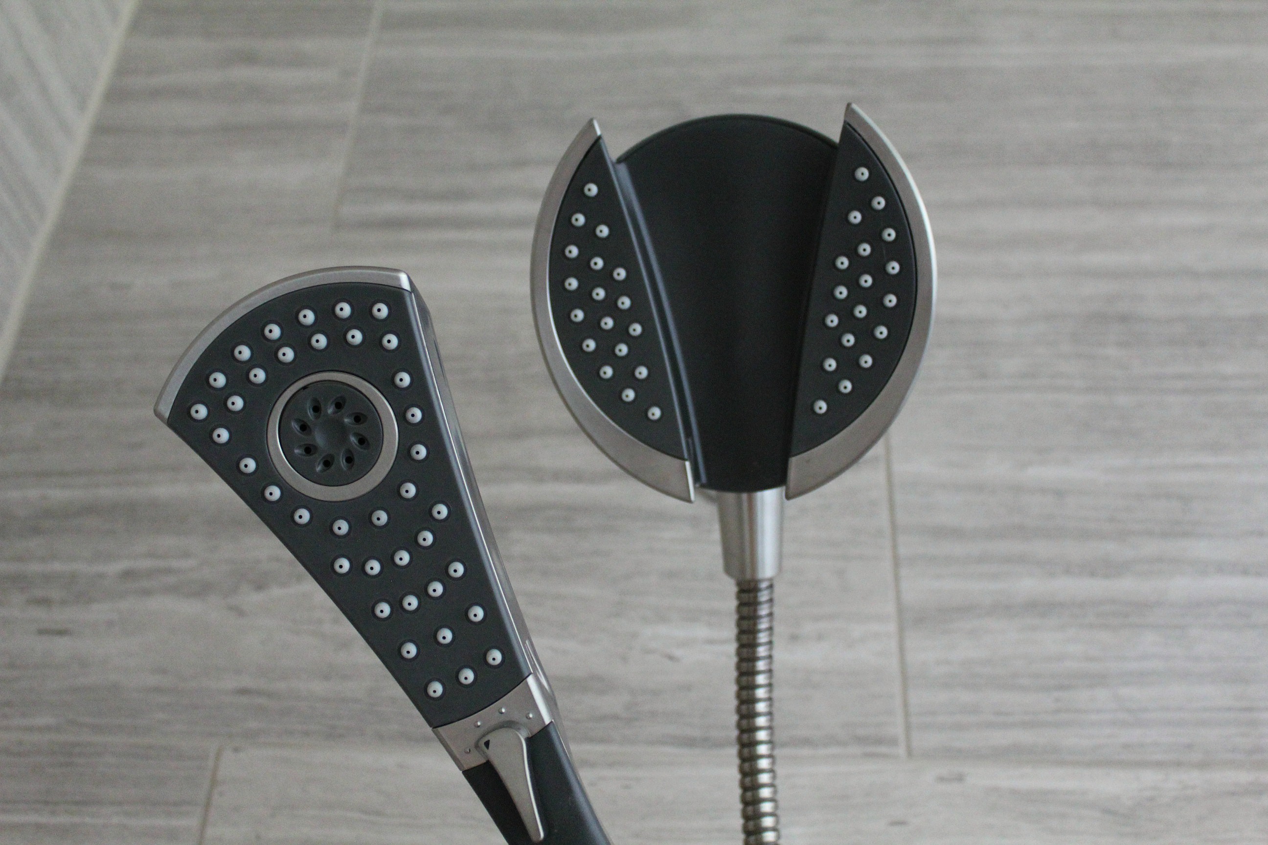
ReplyDeleteGreat job on this bathroom! I love the expansion of the shower opening. May I ask what color finish is the Delta In2ition Carlisle shower fixture set?
ReplyDeleteThanks, Bobbie! The finish is stainless, but it's not shiny like chrome, it's more of a brushed nickel look.
ReplyDelete