It's difficult not to compare this new house with our last one - we had spent seven years making changes and improvements, making it ours. Just like a fitness journey, "You can't compare your beginning to someone else's middle", I have to keep reminding myself that the new house will be beautiful some day and the joy is in getting it there.
With that in mind, I thought it would be fun to take one last look at our old house, the before & after, and highlight some of our favourite projects.
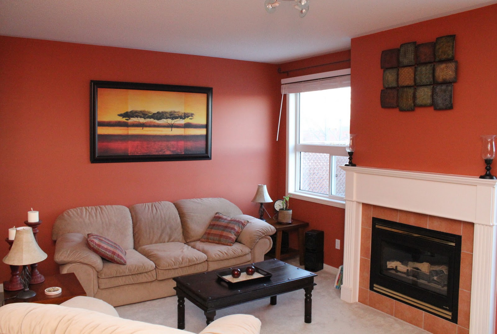
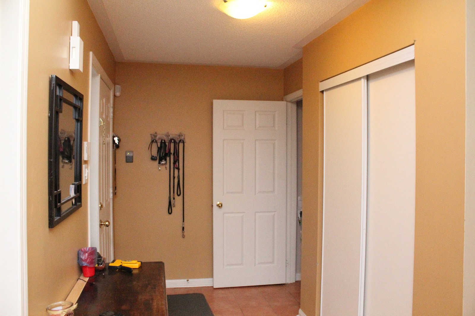
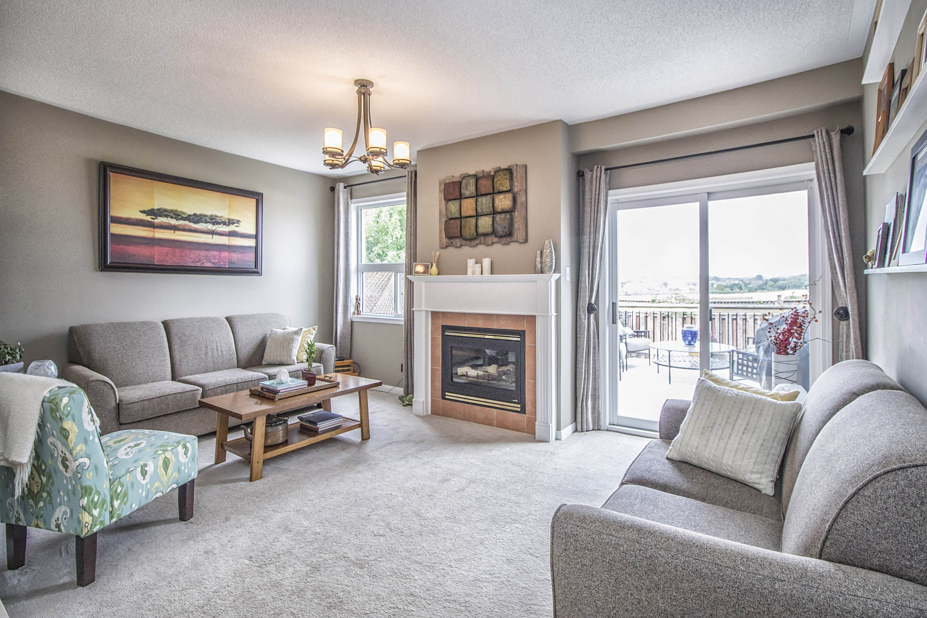
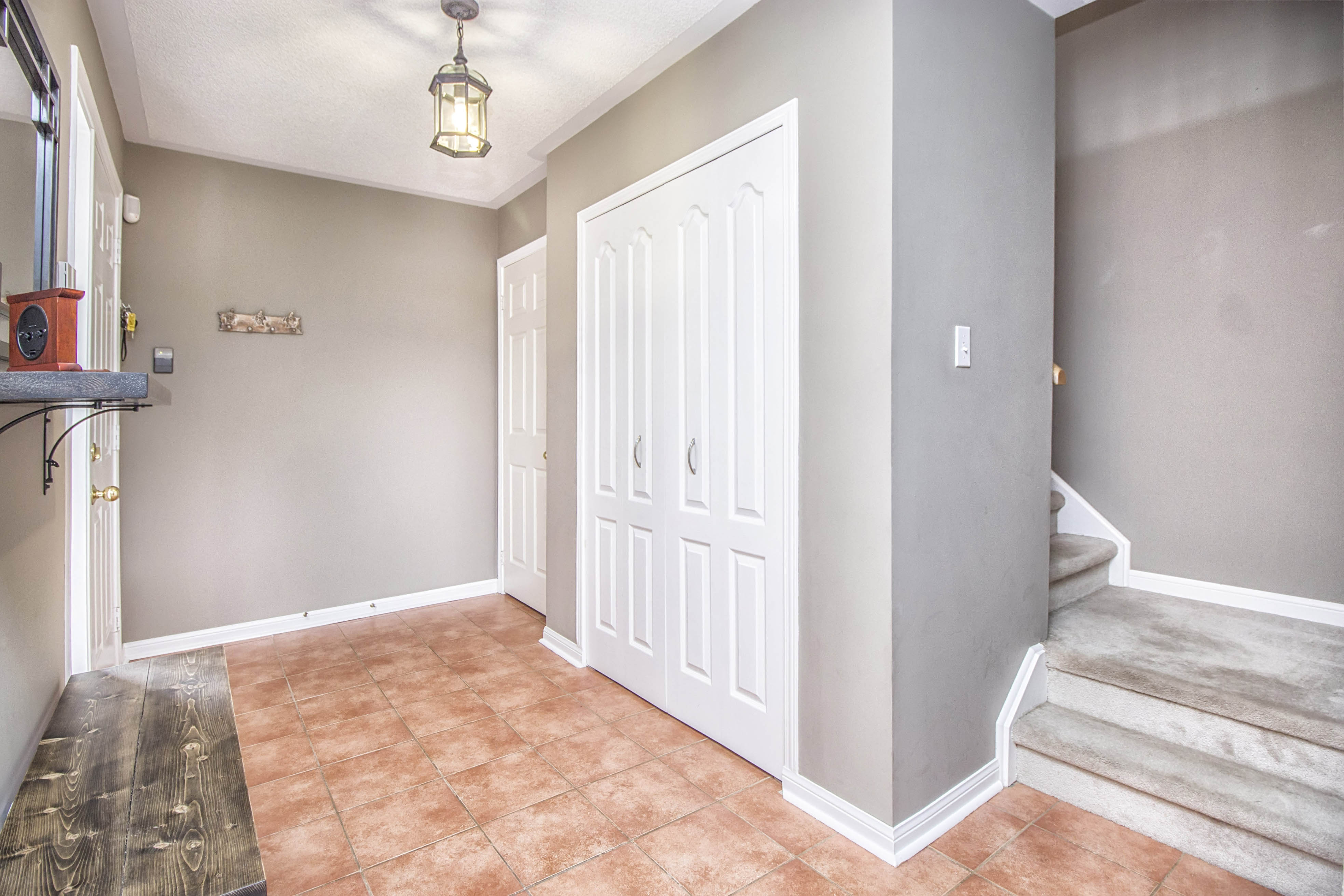
When we moved in, the house was mostly decorated in green, yellow, and orange. We thought it was perfect and didn't change a thing. It took about two years before it started feeling a little too Southwestern for our tastes. We slowly brought in some neutrals, starting with the living room and foyer.
Before:
After (BM Ranchwood):
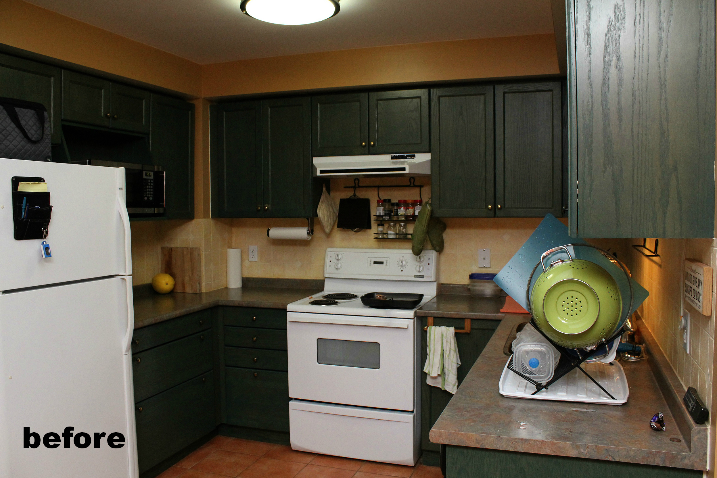
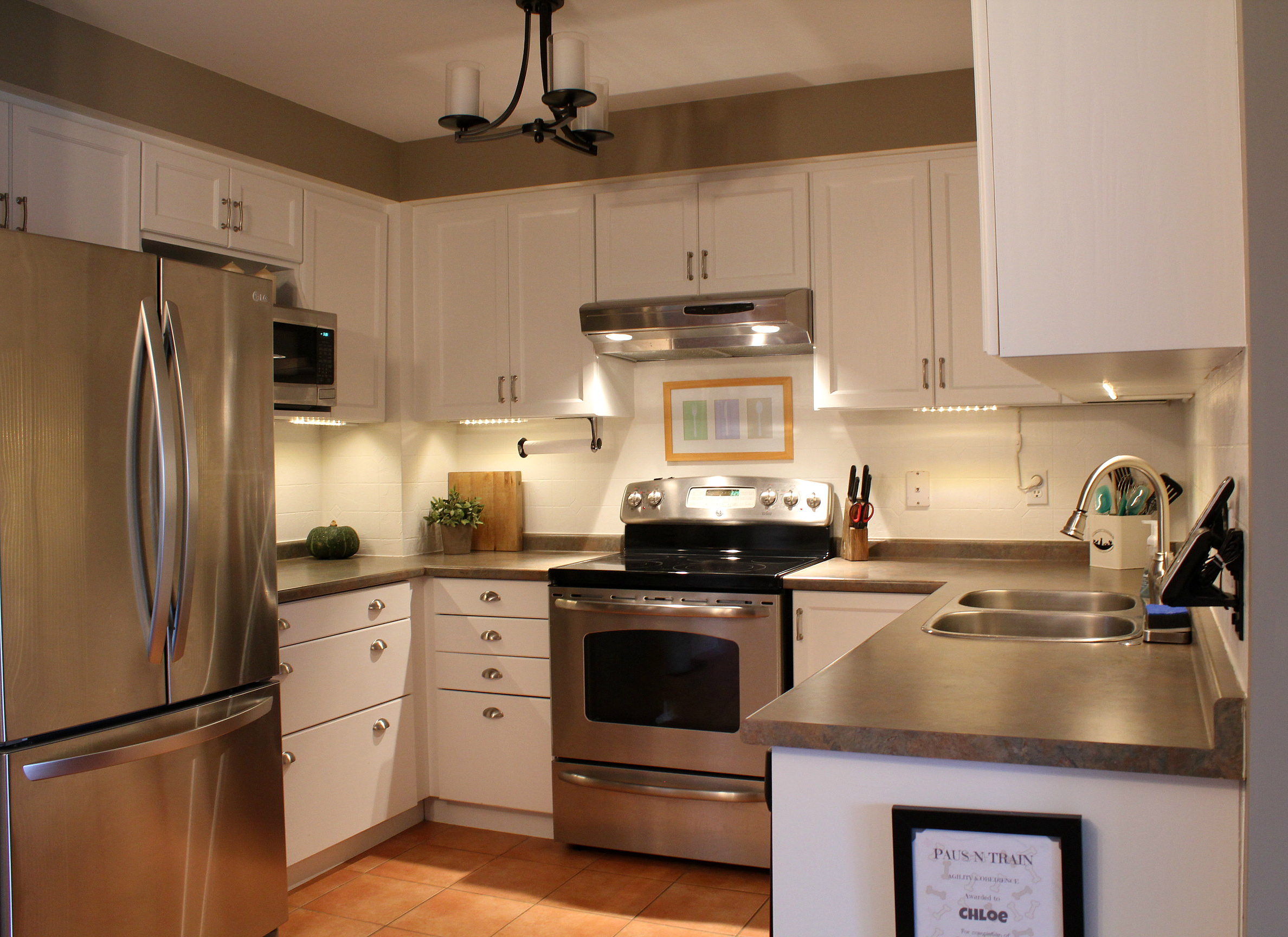
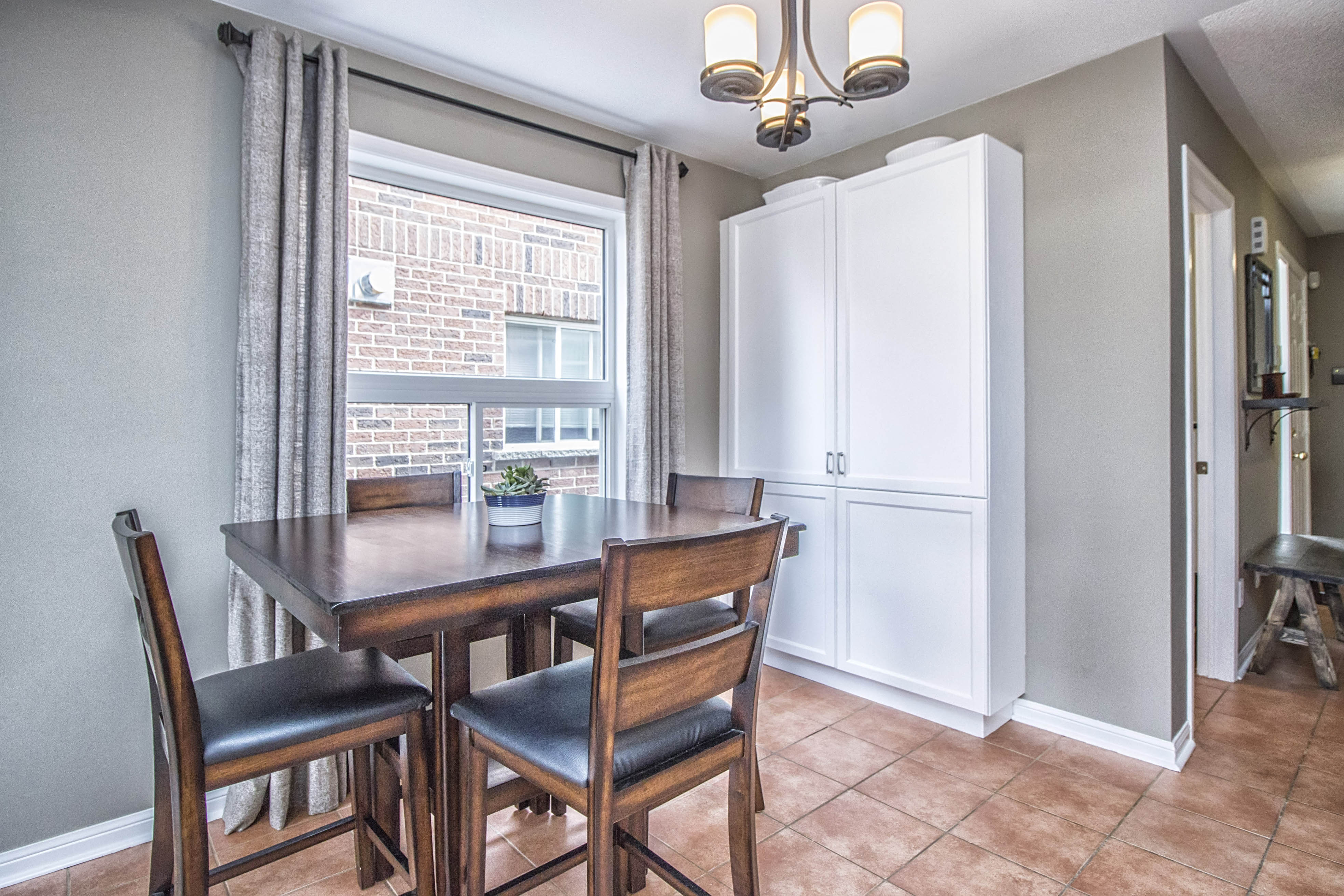
We also added undercounter lighting (touchless!), and changed out all of the appliances. We kept the terracotta-coloured tiles and I think they go just as well with taupe and white as they did with yellow and green.
Before:
After:
Before:
After (BM Nimbus Grey):
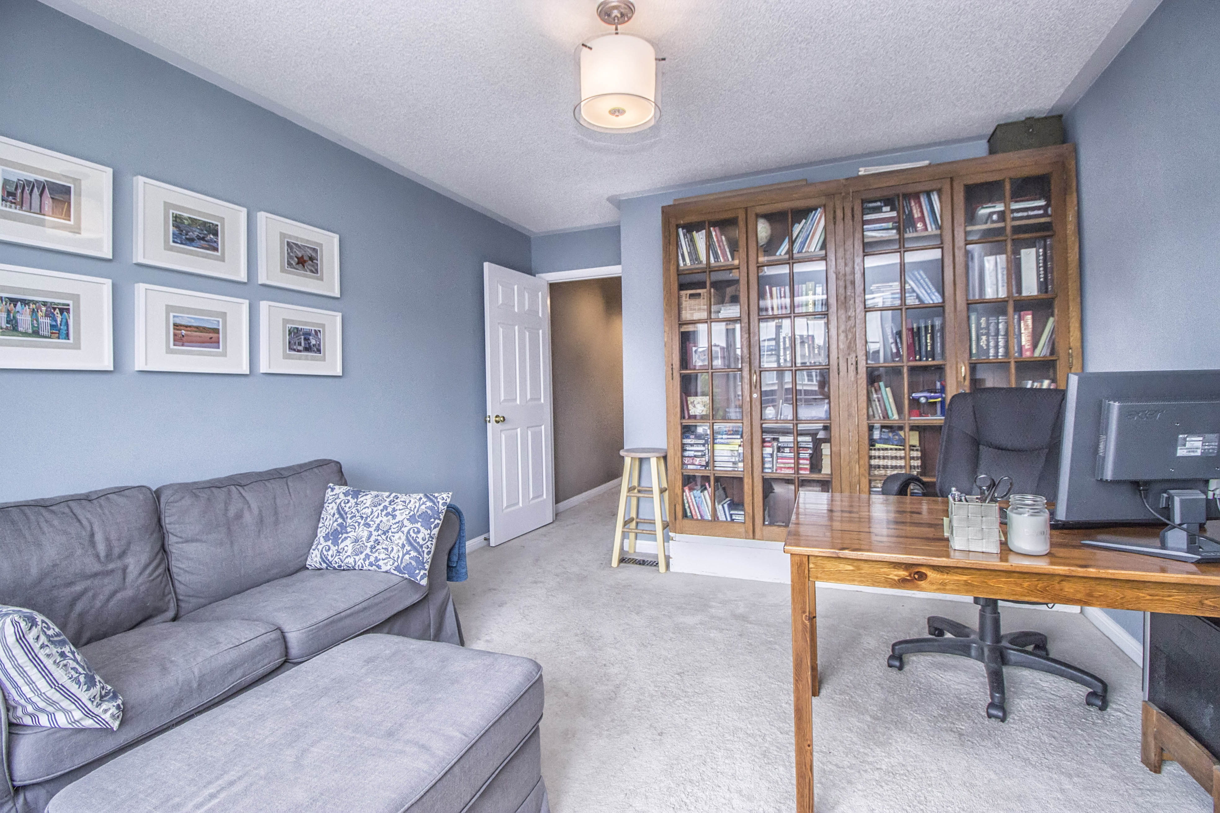
The custom-made glass front bookcases have been with me for over 15 years - from my apartment in Toronto to three houses now - I'll never let them go.
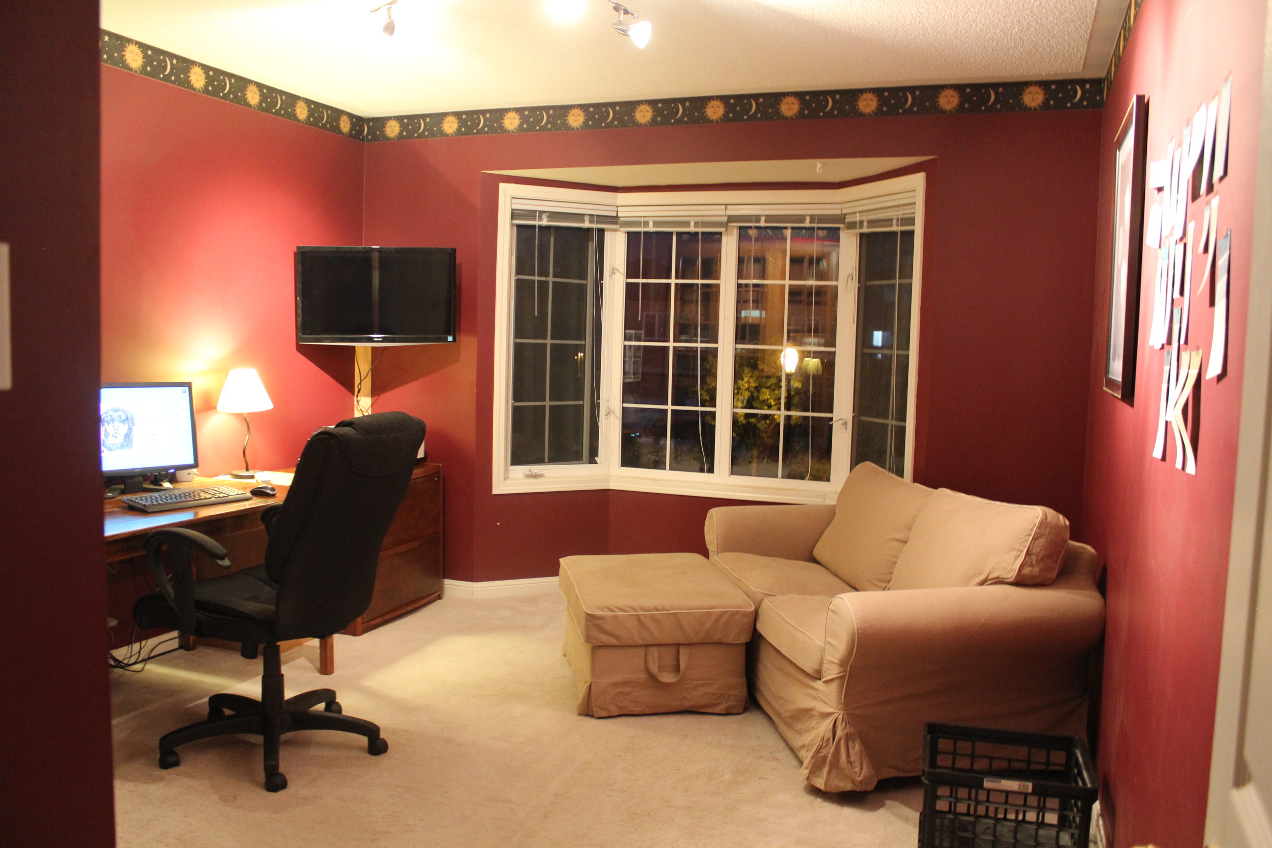
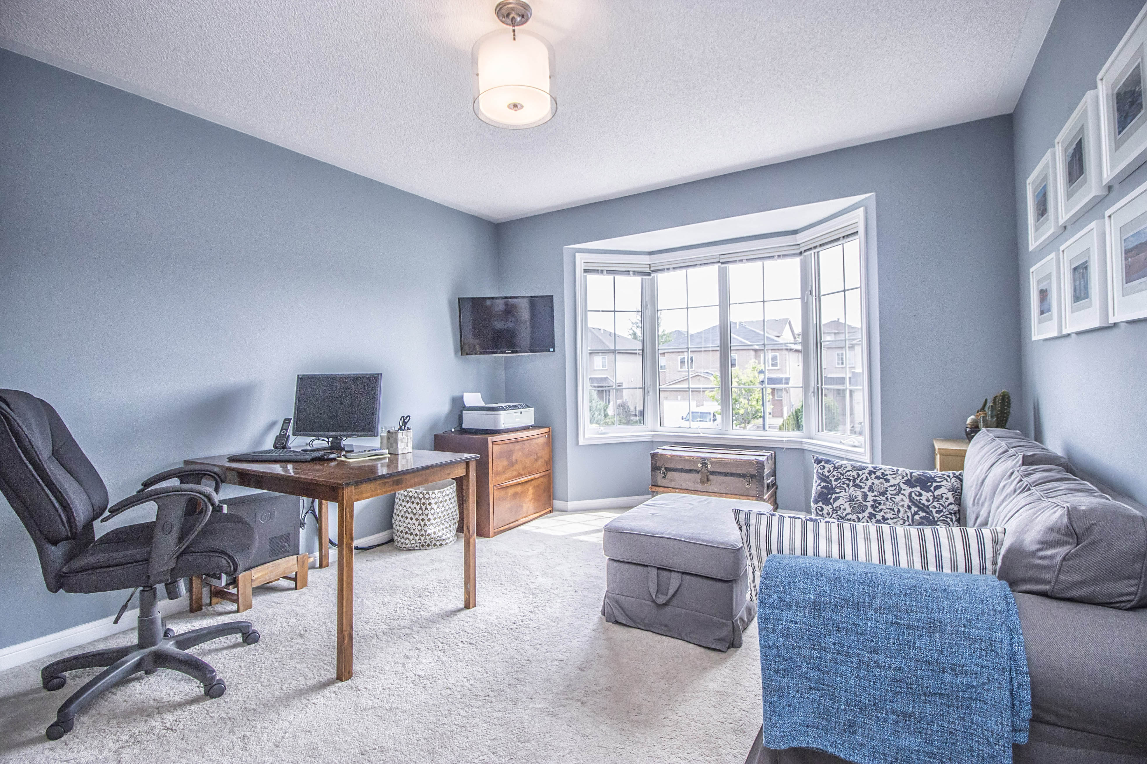
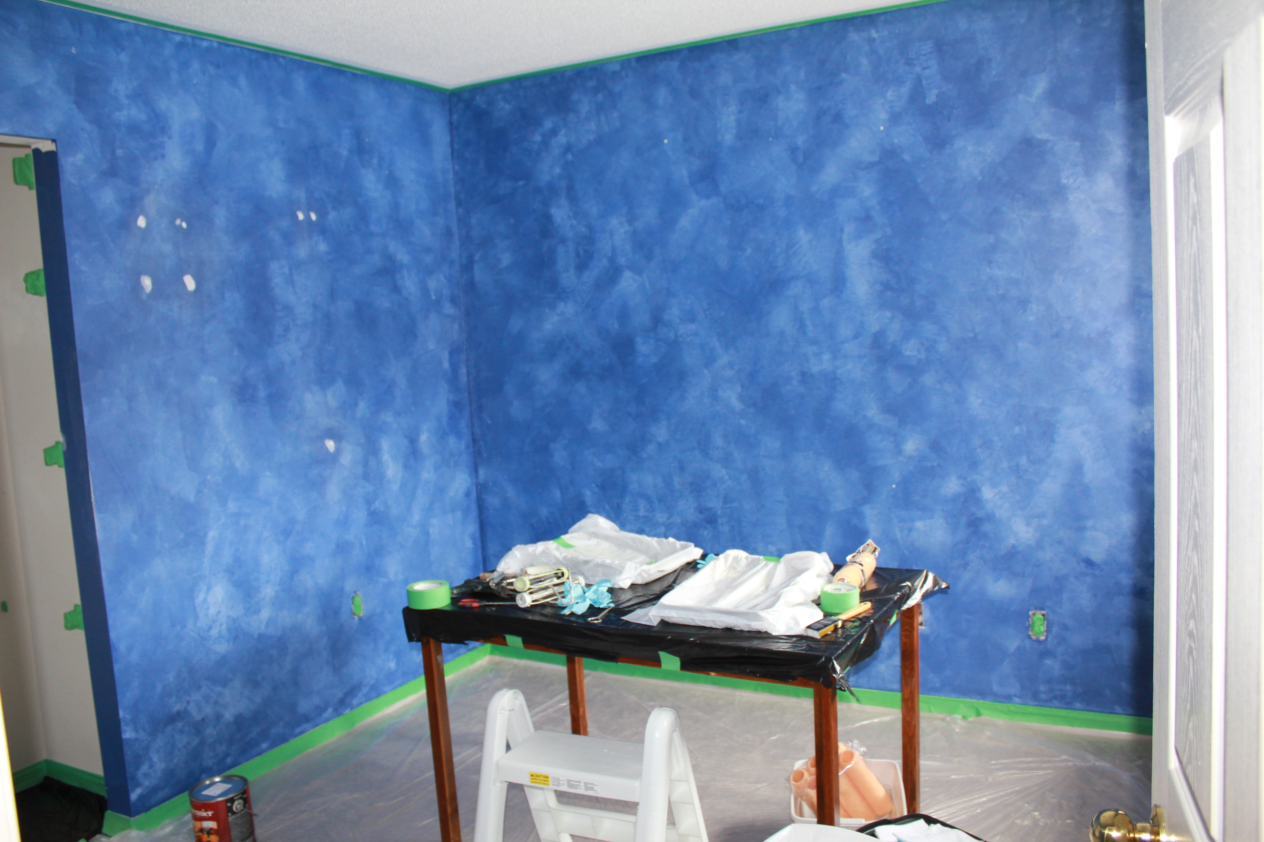
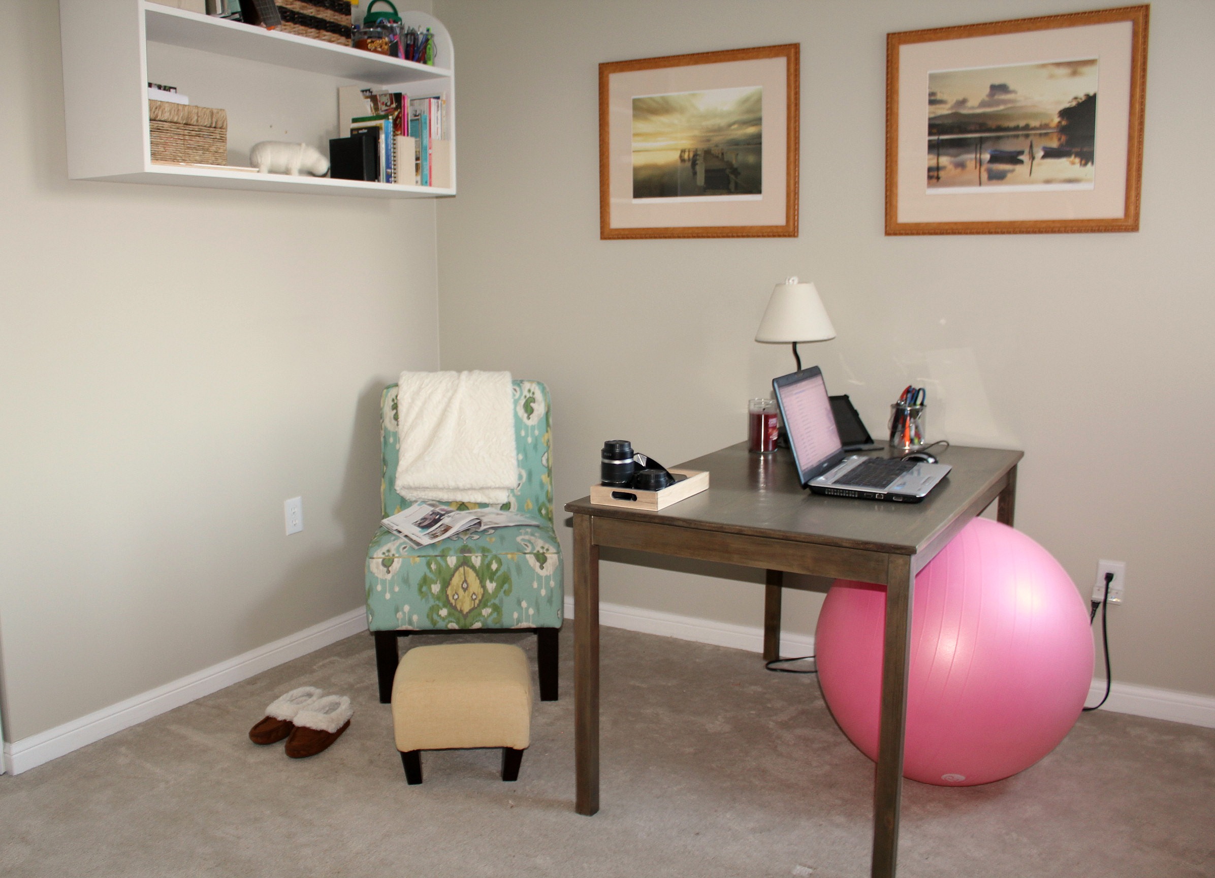
We turned one of the bedrooms into a craft room. It really became an everything room - gift wrapping, sewing, photography studio, and crafting of course. It started out midnight blue with little stars stickers all over the walls. Big change!
Before:
After:
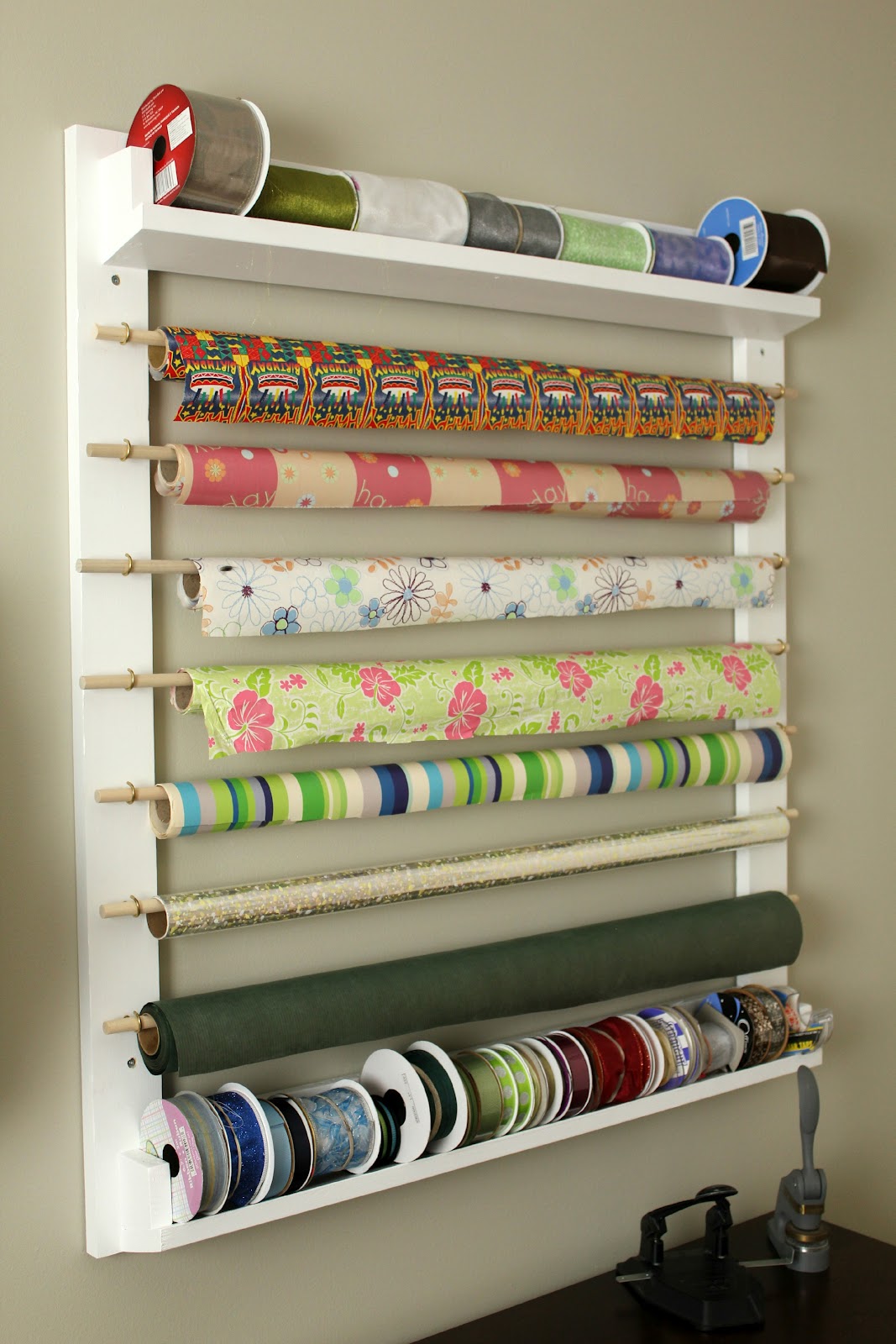
My favourite (I say that a lot) project in here is the wrapping paper and ribbon station. Tom and I designed it together using ideas we saw online and then tweaking it along the way until we had what worked for us. It was wonderful having all of my wrapping supplies right on hand whenever I needed them.
The guest room was the first room I painted here. It started out as a bright, bright yellow. I painted it one weekend while Tom was away. He didn't even notice it had changed until I told him about a month later. I just went to the paint store and grabbed a colour that I liked. I didn't like it for long but never got around to changing it either. So this room ended up being a mishmash of leftover decorating items. We even stored all of our extra artwork under the bed! It does contain my first piece of refinished furniture though - the stained & waxed dresser from Goodwill. This is when I fell in love with finishing a piece with furniture wax instead of polyurethane.
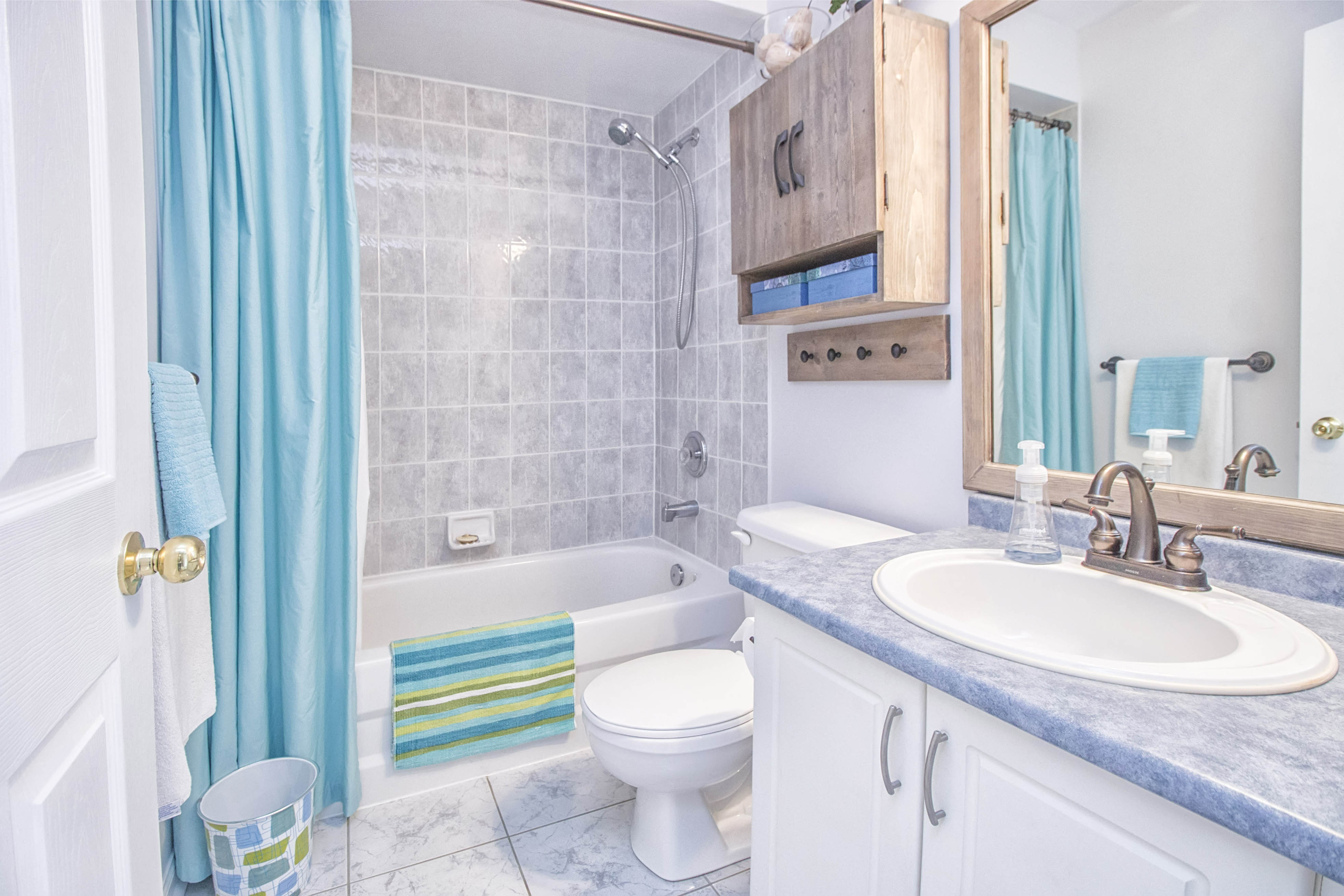
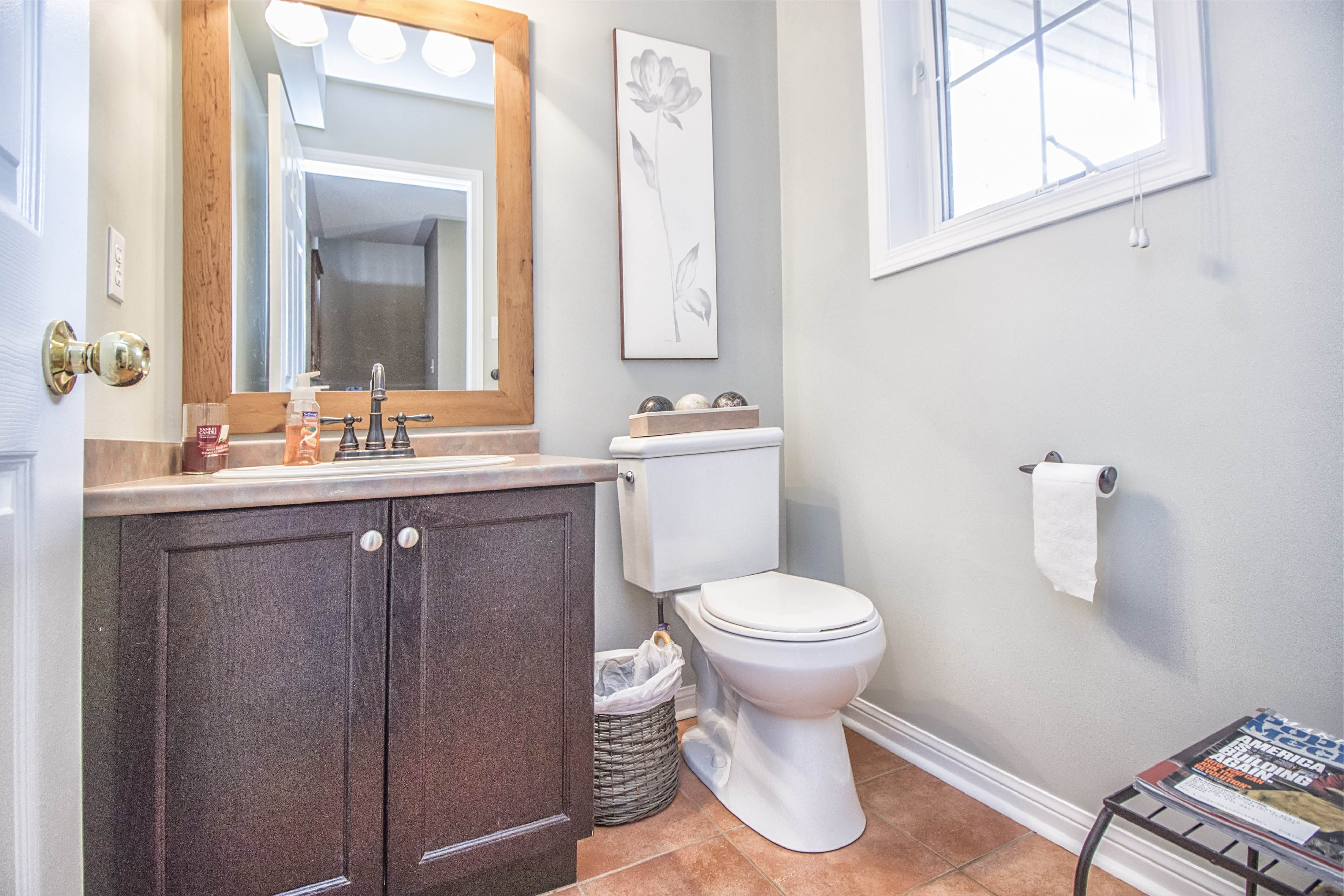
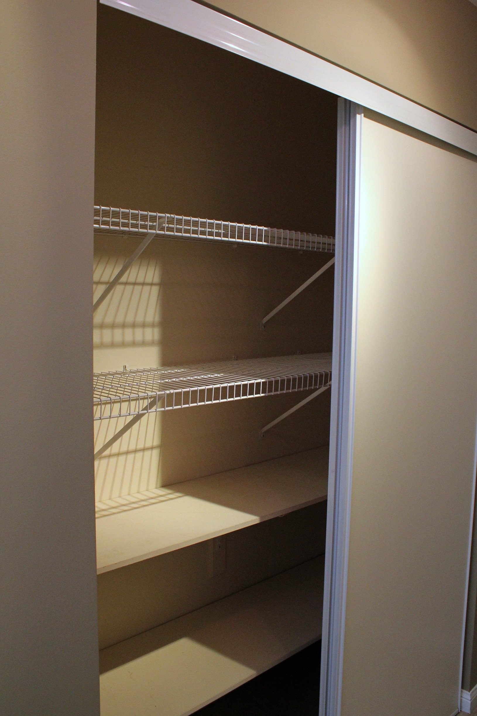
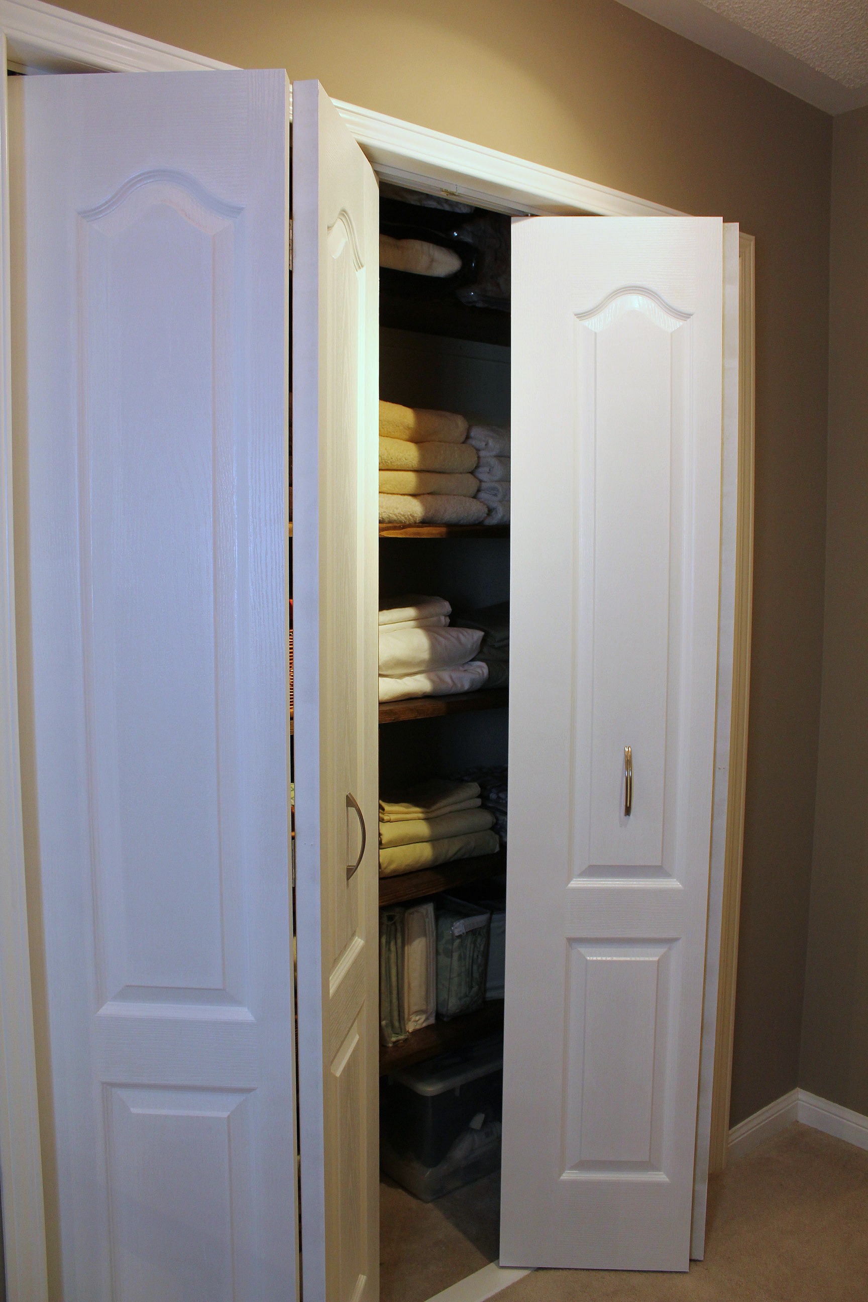
Smaller projects were the main bathroom, the powder room, and the linen closet in the upstairs hallway. In the main bathroom, beyond paint, we replaced the medicine cabinet and mirror with custom-made pieces we did ourselves. Tom has become an old hand at building mirror frames. The ones in the powder room and ensuite were built by him as well.
Before:
After:
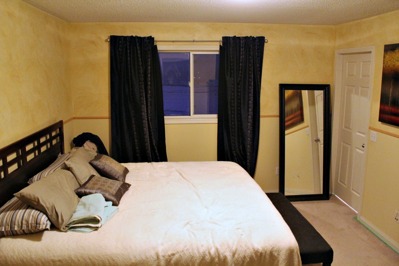
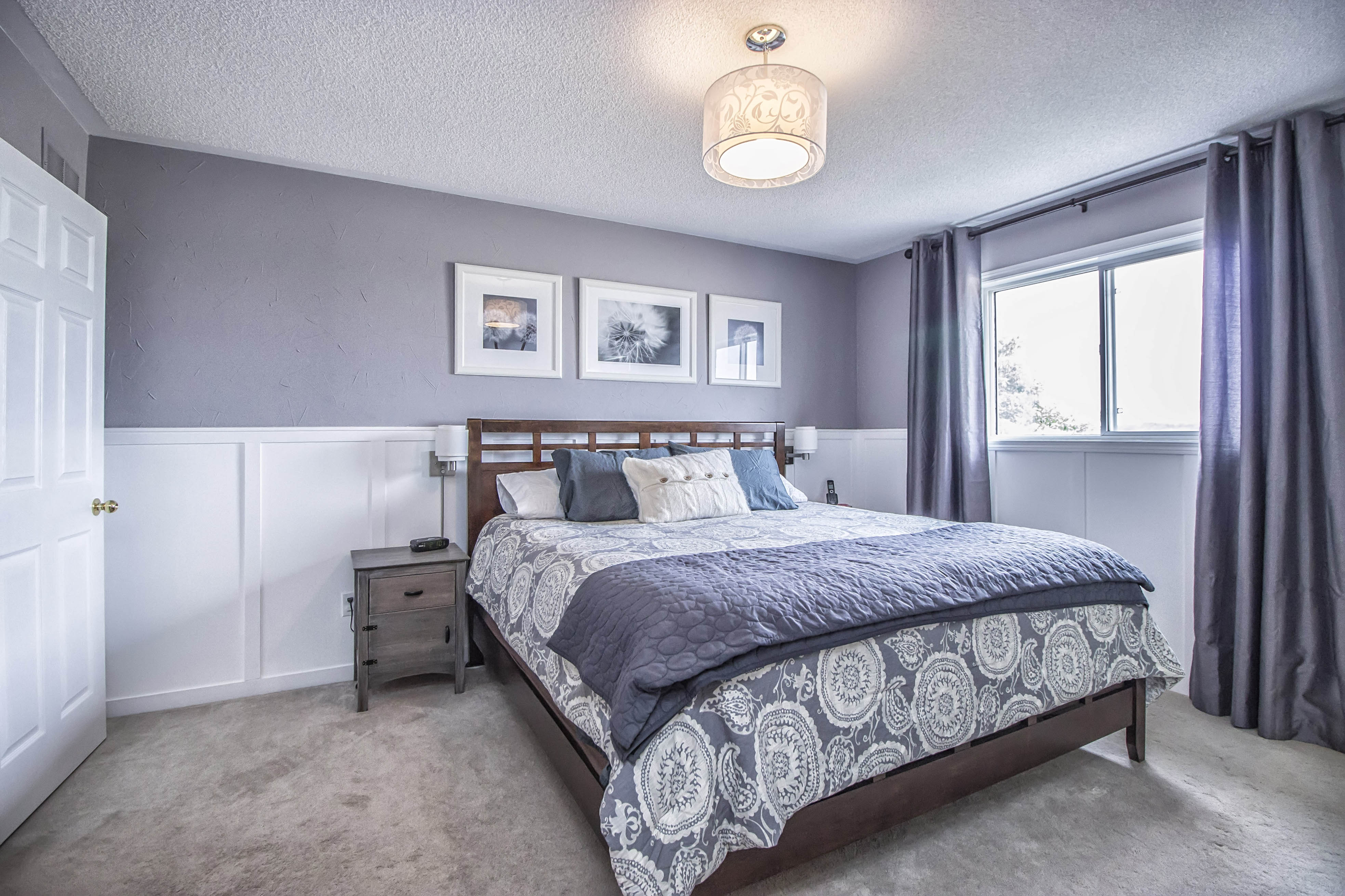
The two biggest changes upstairs were the master bedroom and the ensuite bathroom. The top half of the bedroom walls were done in a textured plaster with a brown glaze over yellow paint. I wasn't a fan, but I thought it would be too much work to scrape it all down and repair the walls. So I just painted it all one colour - first a dark grey (BM Arctic Seal) that was way too dark (think prison cell) - and then a lighter grey that was much more soothing.
Before:
1st Change (BM Stormy Monday):
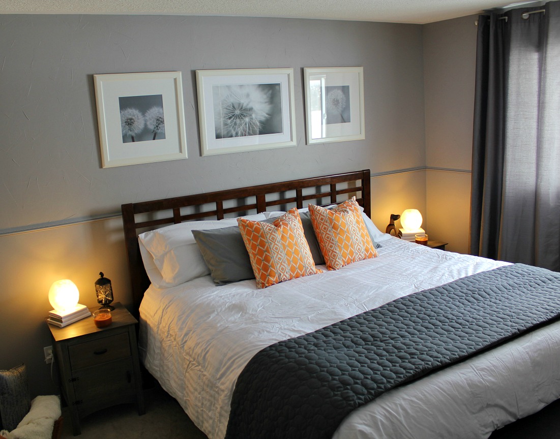
I got a hankering for more though, so I installed faux board and batten wainscoting all around the bottom half of the room. This project was all mine. I learned so much about using different power tools that week. And my body paid the price for all that crawling around on the floor. There's something I adore about grey and white together. The room felt like a suite at a fancy hotel. One covered in dog hair of course.
After (BM Stormy Monday):
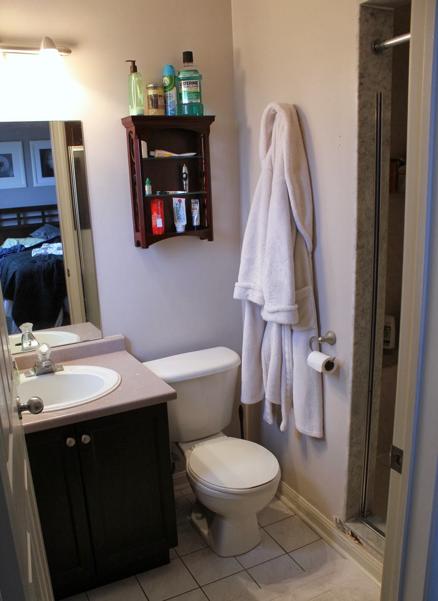
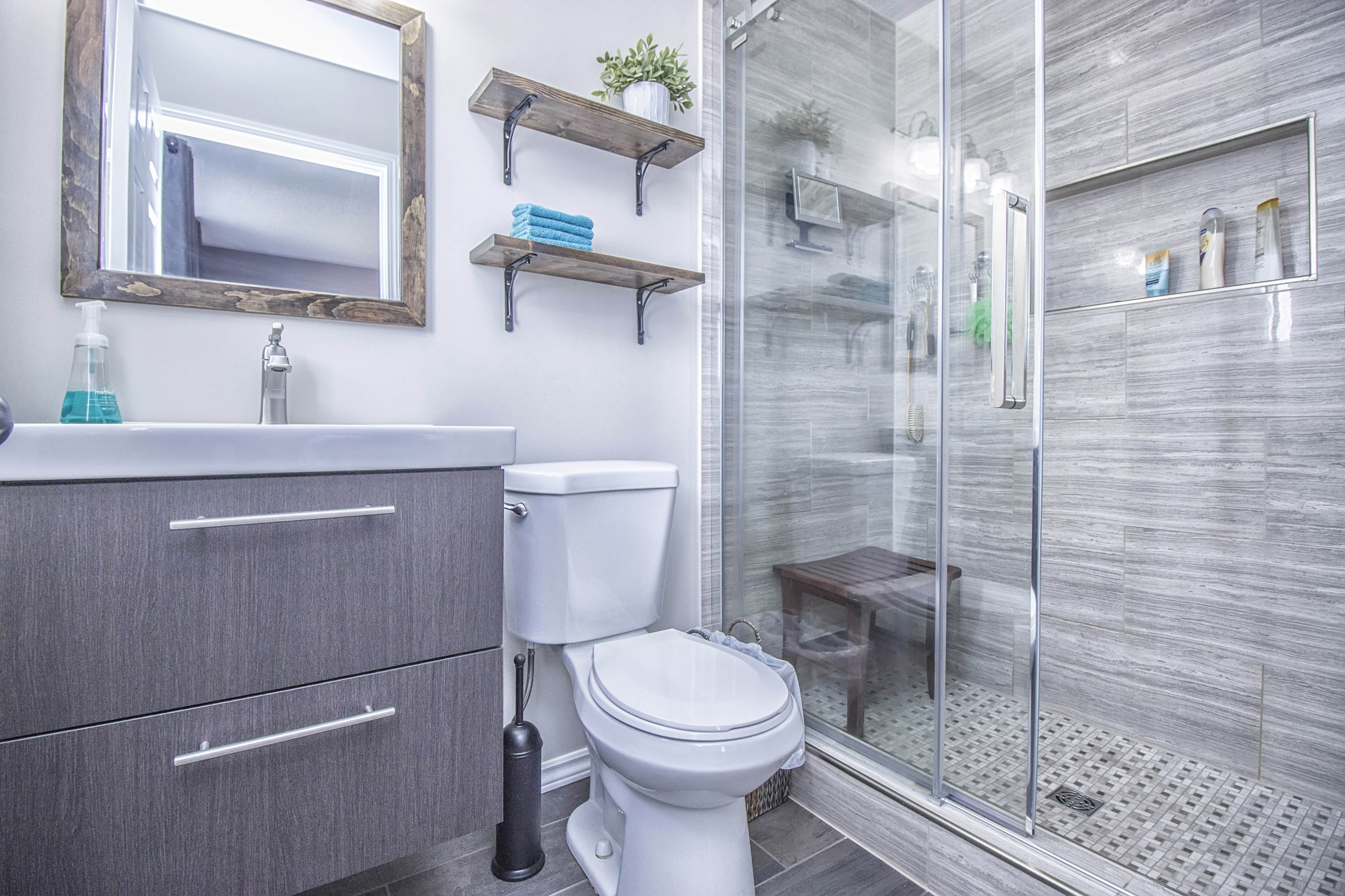
The ensuite bathroom was our pride and joy. It was a complete gut, right down to the studs. We even had to replace some studs because they were warped and weren't even connected to the drywall! We painstakingly chose all of the finishes, even driving to another town to get more tile when our local store ran out just as it was almost finished. We had the tile installed by a contractor as we knew it would take us months of evening and weekend work to get it done.
Before:
After:
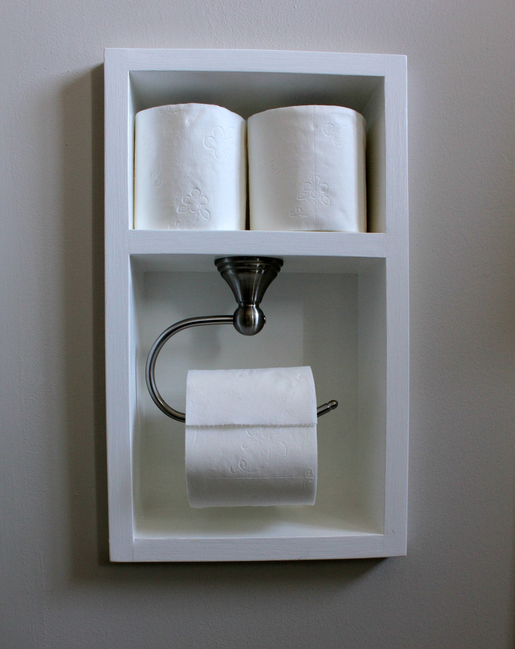
Tom rerouted all of the plumbing himself so that we could have a wall-hung vanity. He also framed out the shower niche, built the mirror frame and shelves, and of course designed and built the inset toilet paper holder that he is so proud of.
The ensuite in our new house is a bit of a blank slate. We'll probably incorporate some of the same ideas - wood grain floor tile, inset toilet paper holder (as if that was in question!), wall-hung vanity - and we're going to have a go at doing it all ourselves. Cross your fingers for us!
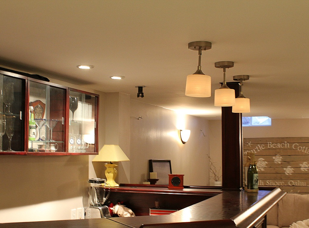
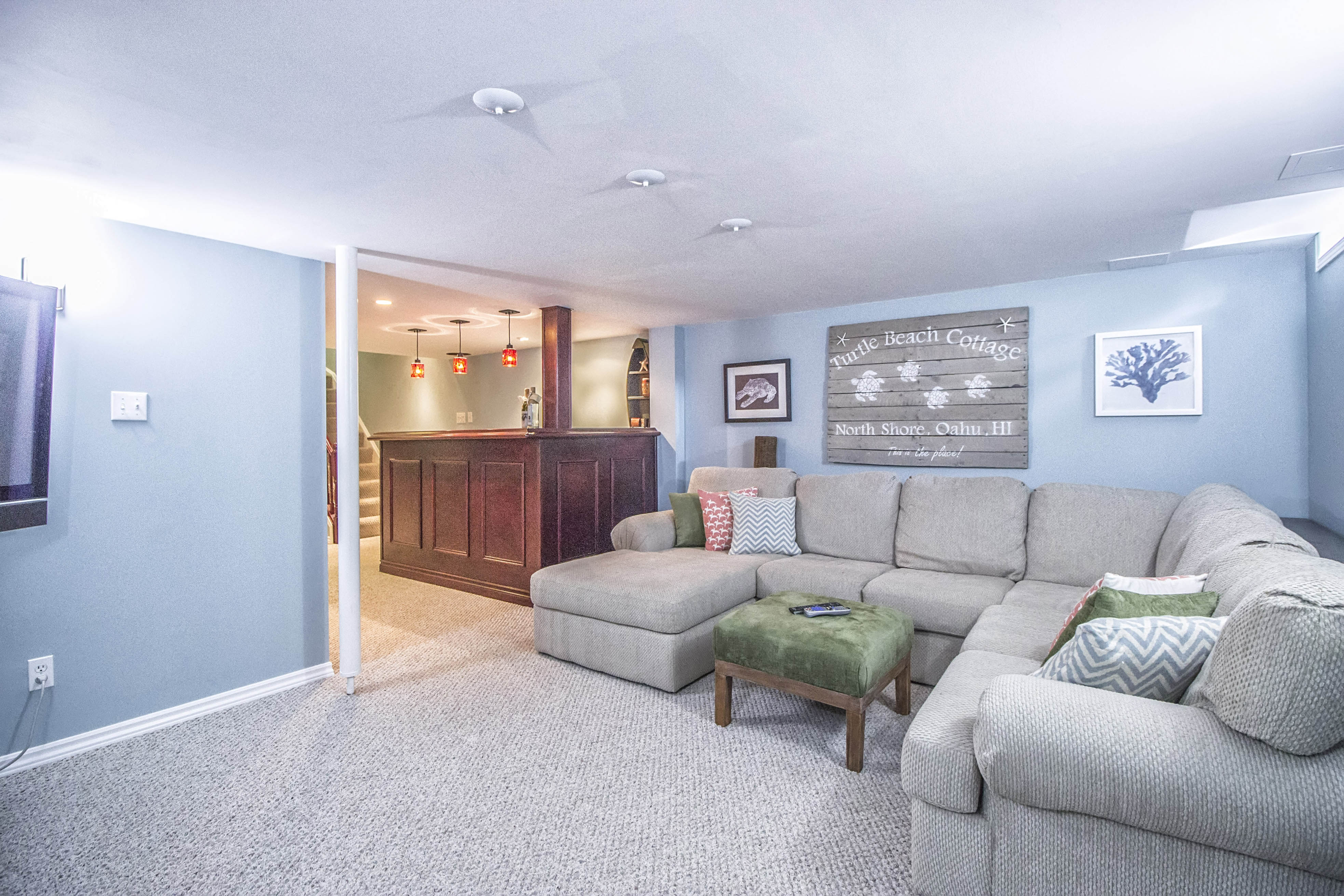
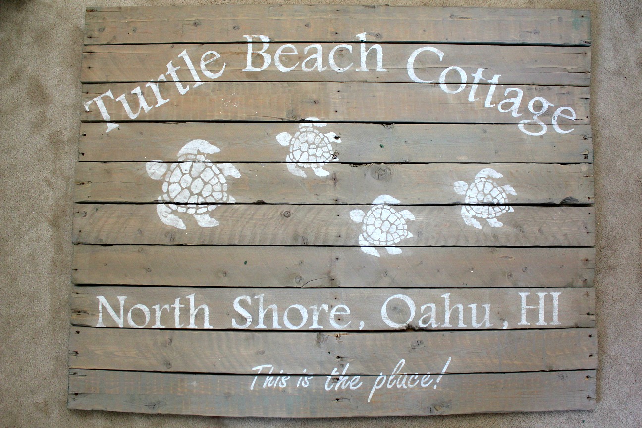
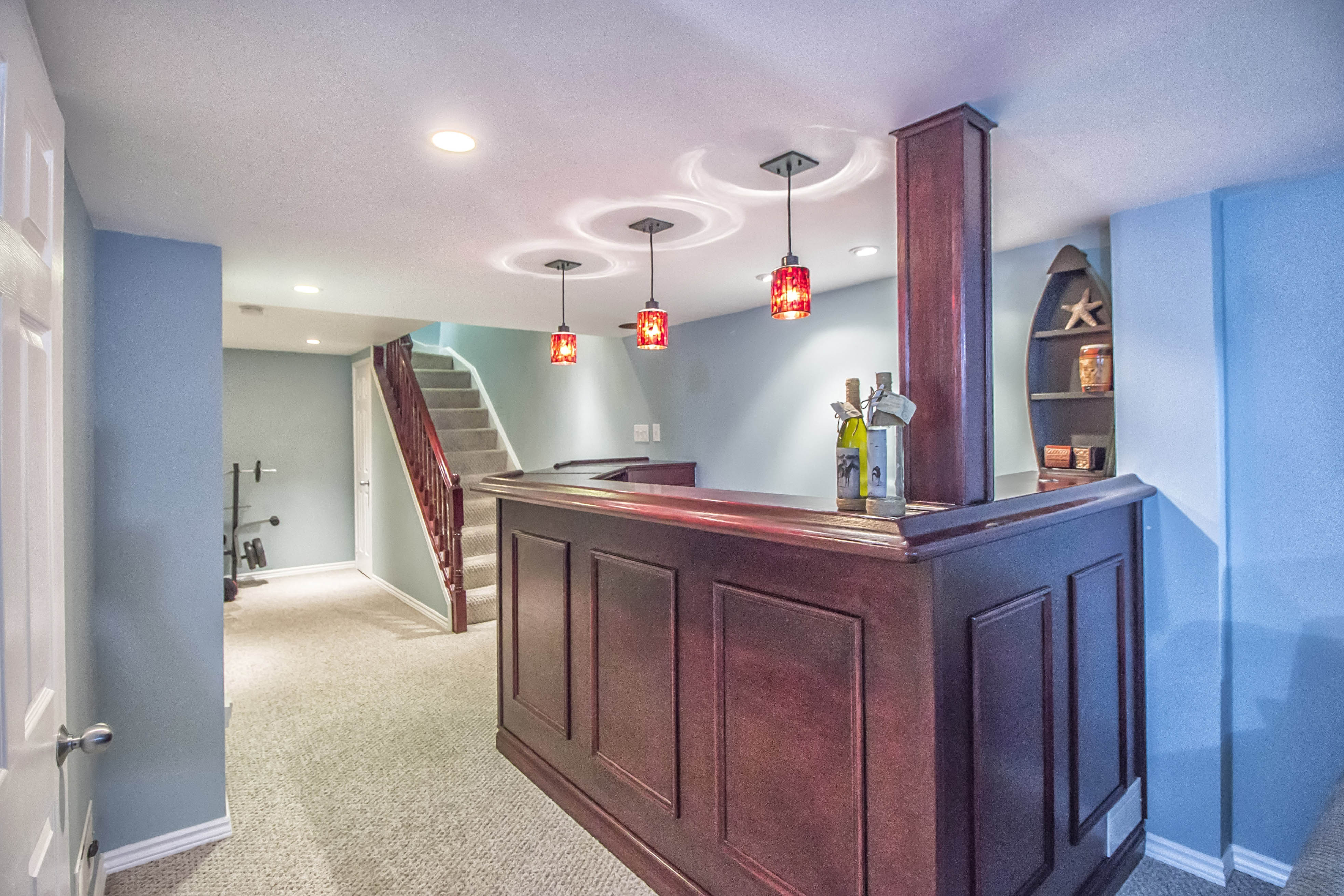
The basement was fully finished when we moved in so there wasn't a lot to do. We rearranged some things like the washer/dryer and water heater, and installed a water softener, but most of the changes were cosmetic. We painted the entire basement a warm blue as we were going for a cottage/beachy feel. We changed out all of the lighting, hung some "beachy" artwork, and I painted a huge pallet sign. It's an homage to our favourite beach rental in Hawaii.
Before:
After:
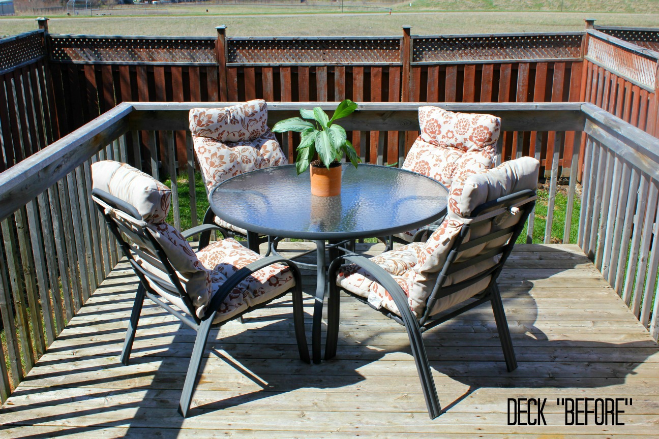
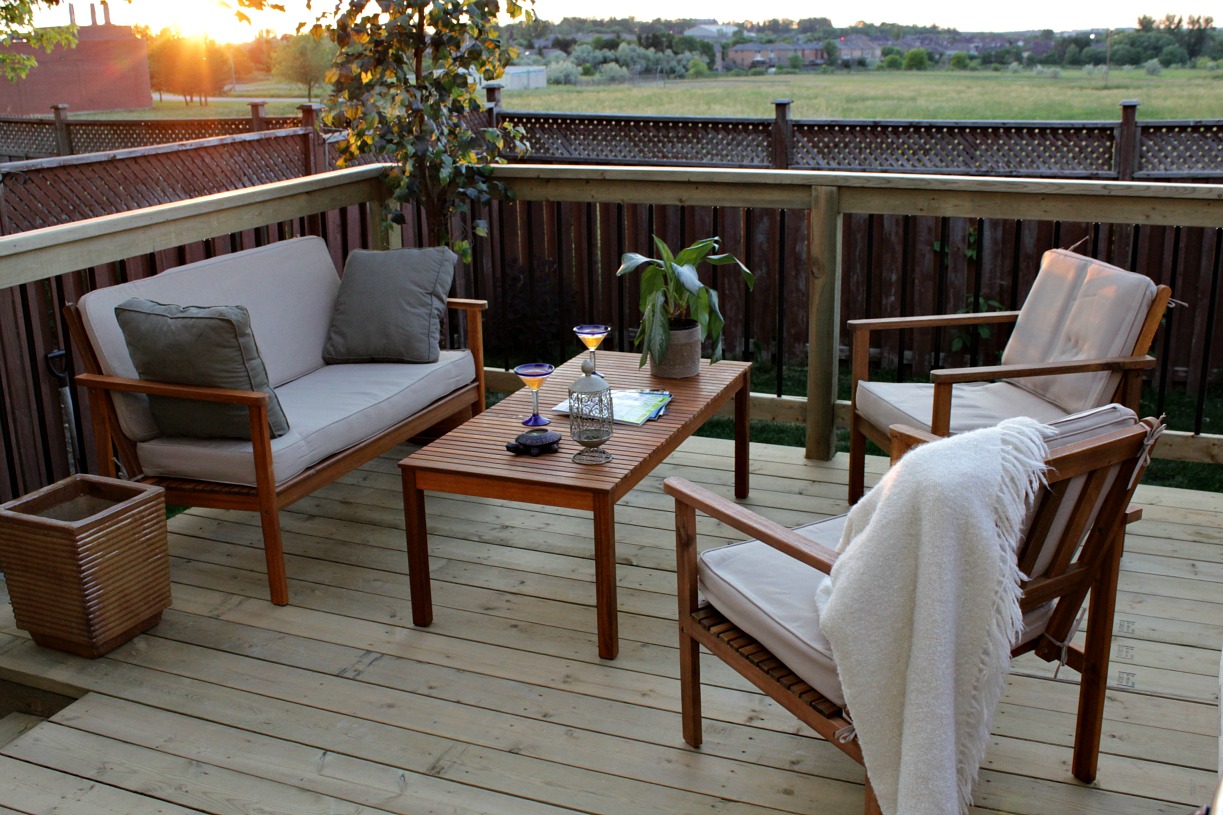
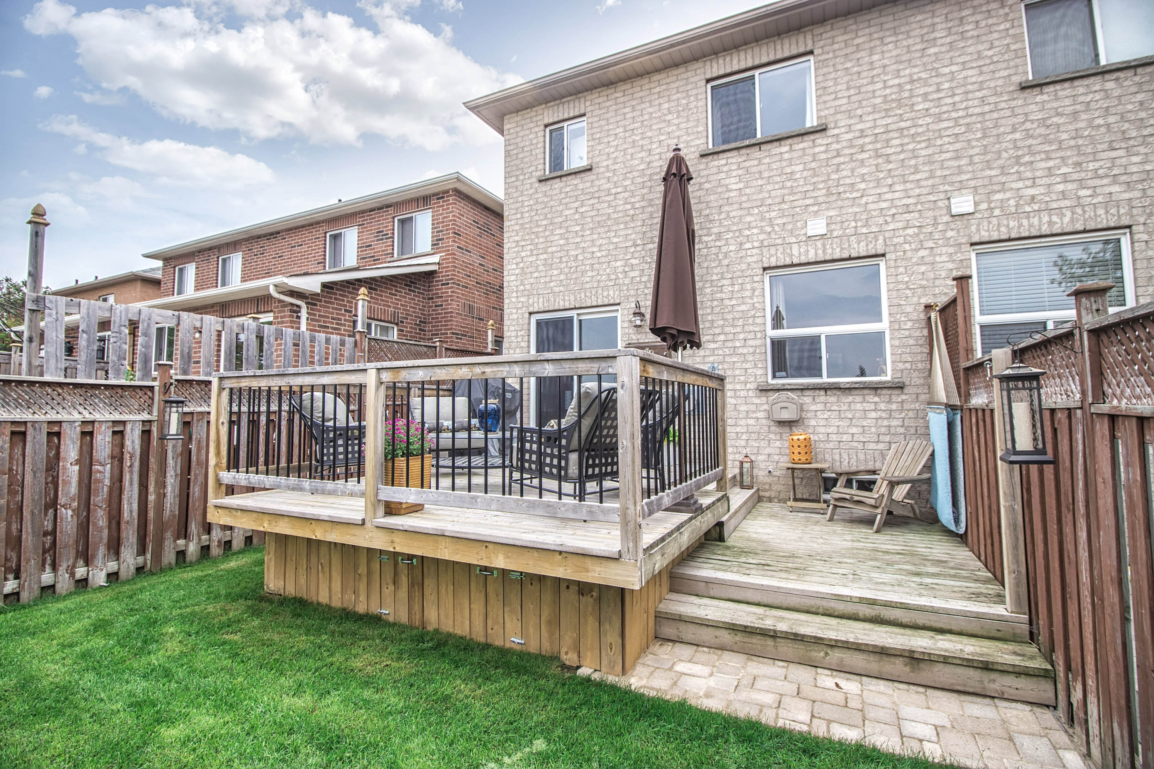
The backyard also got an overhaul. The house came with a tiny, tiny deck, actually two tiny decks attached to each other, but not on the same level. We raised up the second deck, enlarged it, and then added another lower deck off to the side where we hung our hammock. The plain wooden rail pickets were replaced with metal balusters.
The final project was to enclose the bottom of the deck, something we did just a month or so before we listed the house. It's too bad we didn't do it sooner as it really added to the appeal.
Before:
After:
Whew! That was a lot of change. We loved renovating this house. We made a few changes to our previous house (beyond paint), but this one was where we really got our groove on. I'm really going to miss it.
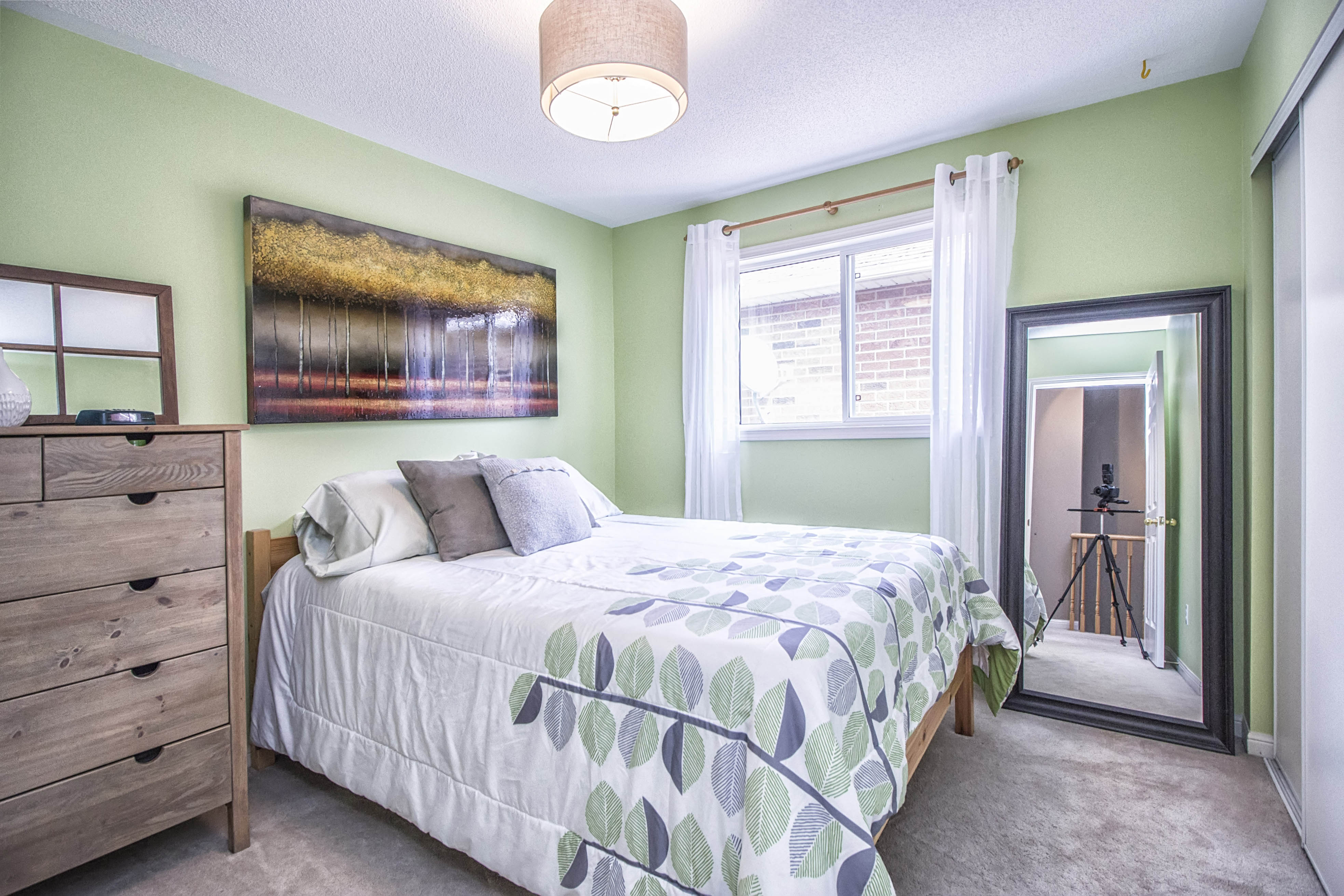
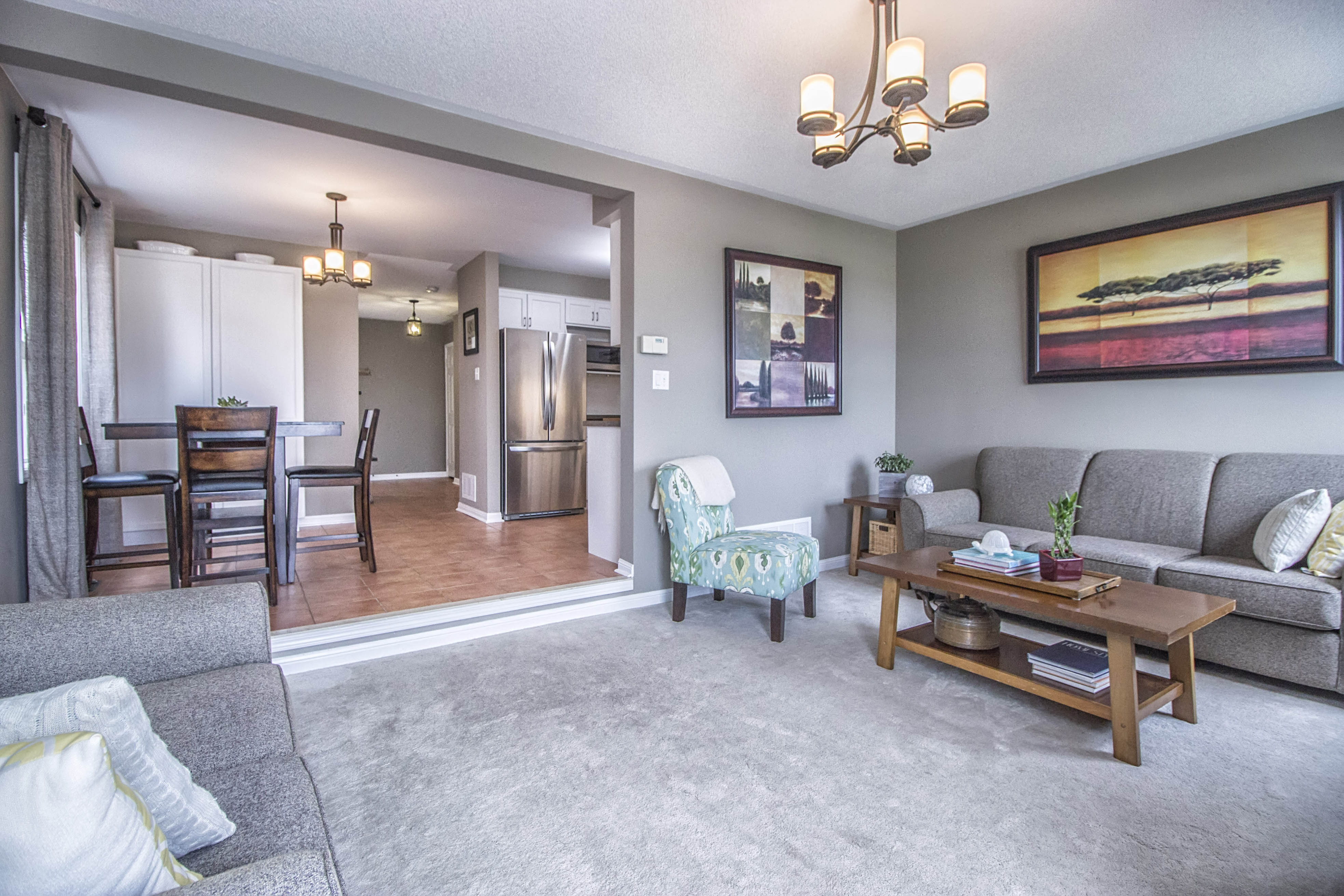
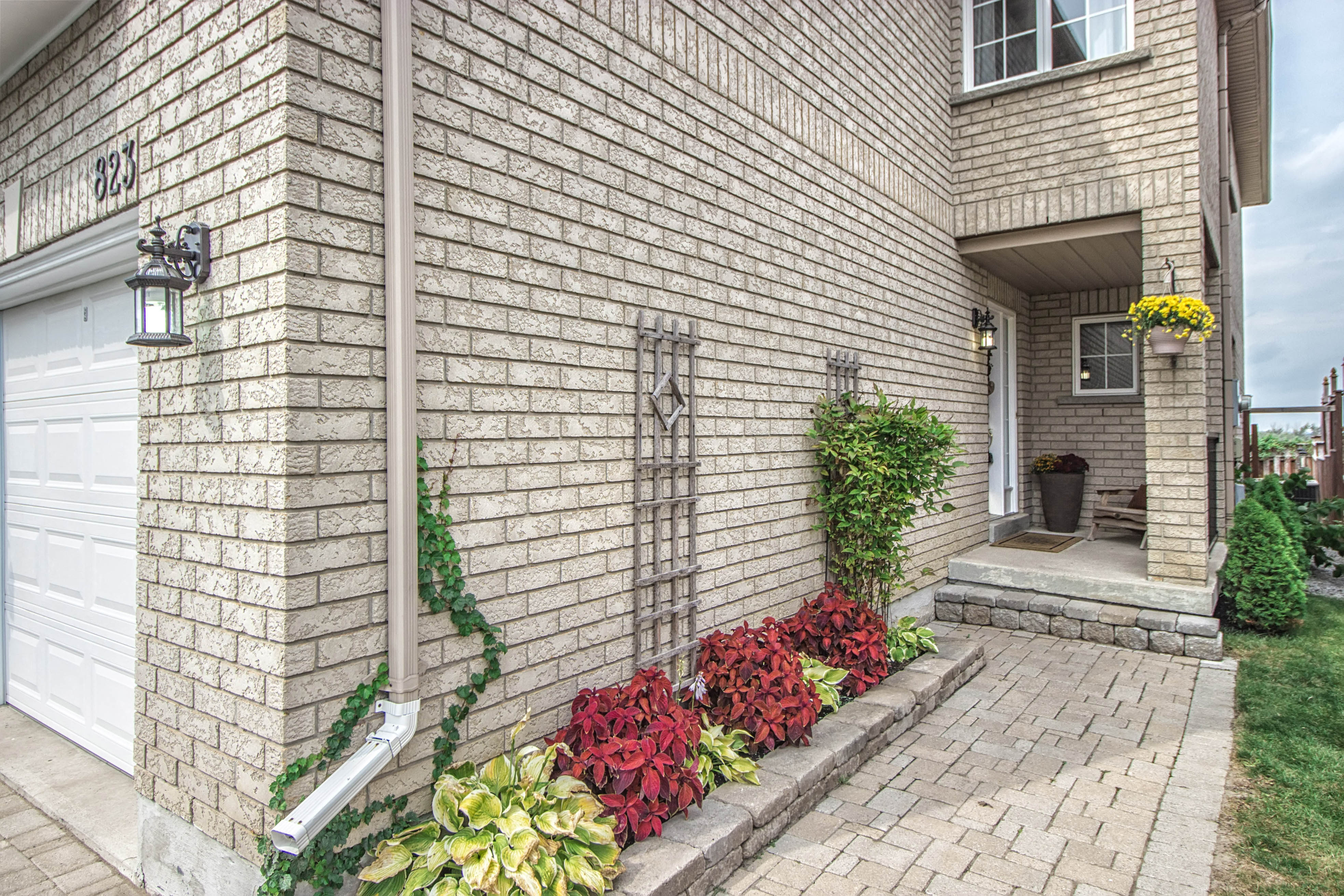
Here are a few more photos from the real estate listing that show it off like a model home.
(All real estate photos courtesy of West Blue Studio Services)


