SEARCH THE BLOG

Sep 30, 2013

Peanut Butter Snickerdoodle Sandwich Cookies

So, Snickerdoodles. Tell me what you know about them. Are they an American thing?

Prior to a few years ago, I'd never even heard of them. We definitely didn't have them growing up. And when I did hear the name, I imagined something like a brownie but with pieces of Snickers chocolate bar in them. Colour me surprised to discover that they are kind of like a sugar cookie, and pretty simple to make.

peanut butter snickerdoodle sandwich cookies

Here's what you'll need for a double batch:

1 cup of butter, softened
1 cup of sugar
2 eggs
1 tsp of vanilla extract
3 cups of flour
1/2 tsp of salt
1 tsp of baking soda
1/2 tsp of cream of tartar*
4 tbsp of sugar
2 tsp of cinnamon
2 cups of peanut butter
1 cup of icing sugar (powdered sugar)

*Note: I didn't have any cream of tartar so I substituted 1 tsp of baking powder and reduced the baking soda to 3/4 tsp.

What to do:

In a large bowl, cream together the sugar and butter. Add the eggs and vanilla and stir until smooth. In a separate bowl, mix together the flour, salt, baking soda, and cream of tartar. Add the dry ingredients to the wet ingredients and mix completely. Refrigerate the dough for 60 minutes.

Preheat your oven to 300 degrees.

In a small bowl, combine the sugar and cinnamon. Take a 1-2 tablespoon-sized portion of your dough and roll it into a ball between your palms. Roll the ball around in the cinnamon-sugar mixture to completely cover it, and then place it on an ungreased cookie sheet. Press down on the ball with your fingertips or the palm of your hand to flatten it out. My cookies were about 2 and a half inches in diameter, so adjust your portion size to suit.

snickerdoodles

Place your tray of cookies in the oven and bake for about 12 minutes, until they are lightly golden. They may still look a little under-cooked, but don't worry, they're done. They should be soft and chewy in the middle.

Let cool.

snickerdoodles

For the filling, mix together the peanut butter and icing sugar. The one cup of sugar is just an estimate - I added the sugar a little at a time until I got the flavour I was looking for - not too sweet, but not dry like a peanut butter sandwich.

Spread the filling on the back side of one cookie and top with another cookie, bottom side down.

Done!


peanut butter snickerdoodle sandwich cookies

snickerdoodles

peanut butter snickerdoodle sandwich cookies

peanut butter snickerdoodle sandwich cookies

snickerdoodles


Sep 26, 2013

Kitchen Makeover Reveal

I'm embarrassed to admit that it's taken a year to finish our kitchen makeover. If you go back and read my first post on it, I was so excited and expected to be finished in about two weeks. I guess the joke was on me.

But it's done! And it's fabulous! Well, as fabulous as a tiny kitchen with no window and a small budget can be.

kitchen cabinets white paint

The timetable ended up being something like this:

October - sand upper doors in preparation for staining dark brown. Sanding off green factory stain is hard.
November & December - do absolutely nothing. Host Christmas dinner with no cabinet doors. Classy.
January & February - sand a few more doors. It's too cold out!
March - realize stain won't all come off and change plans from staining cabinets to painting them white.
April - paint doors a little at a time, with a marathon on Easter weekend.
May - install doors and hardware, sand and paint drawers.
June - go on vacation & don't think about kitchen.
July - buy new refrigerator, try to burn kitchen down the next day (my bad).
August - try to figure out what to do with backsplash - tile? paint? tile & get new countertops? just leave it and live with it? Flip-flop back and forth.
September - paint backsplash to match cabinets because we can't find tile to match the countertop and a new one is too expensive.

So, needless to say, getting the kitchen done wasn't exactly a high priority for us this year.

Let me show you the before shot:

kitchen before

This is about 2 years ago. You can see that we had yellow walls, green cabinets, and orange tile. Margarita, anyone? It didn't really bother us that much until we painted the walls. The living room, dining room, and kitchen are open-concept, so if you paint one you have to paint them all. The wall colour we chose was Benjamin Moore's Ranchwood. It's a taupe colour that looks slightly green in our house. We love the colour, but it definitely clashed with the kitchen cupboards.

benjamin moore ranchwood

I'll make a long story short (you can read more about it here and here) by saying that I decided to sand all of the cabinets bare and then stain them a dark espresso shade. I even did some tests on a spare piece of toe kick trim.

stain test board

After weeks of sanding and not getting very far I was starting to lose faith. I had been strongly opposed to painting the cabinets white - one, because everyone else is doing it, and two, because I wanted to see the wood grain. But I had to be realistic and admit that sanding/staining wasn't going to happen. Since the countertops are so dark and there is no window in the room, it really did need to be lightened up.

So full steam ahead with the white paint. We used Benjamin Moore Fresh Start Primer (two coats) and Benjamin Moore Advance paint in pearl finish (3 coats). They dry slowly, giving them time to self-level and produce a nice, flat surface. We didn't have them tinted, just used them straight out of the can. For reference, the BM Advance's white is slightly more yellow than the Behr Premium Plus Ultra paint & primer's white.

benjamin moore paint and primer

I would set up 2 or 3 doors at a time in the dining room, paint them in the morning before work, flip them when I got home and paint the other side, then start all over again the next day. It took nearly a week to do each set.

kitchen cabinets white paint

We sped up the process a bit by taking 15 doors to Tom's work and painting them over the Easter weekend. I'm not sure we slept at all that weekend, trying to hit those minimum drying times.

We chose door hardware from the Threshold line at Target. The handles have a nautical feel with the raised detail giving the look of a boat cleat. We bought matching cup pulls for the drawers, also from Target.

white cabinets brushed nickel handles

white cabinets brushed nickel cup pulls

The final item on the kitchen to-do list was the backsplash. It isn't tiled, or merely painted, I think the previous owners used plaster and a stencil to make a faux tile pattern. It was painted yellow with a darker glaze on top. We were really stumped on what to do because removing it would probably mean drywalling again, but can you tile over such an uneven surface?

When we were at the tile store picking out tile for the bathroom, we looked at tile for the kitchen as well. Even with the help of the sales staff, we came to the conclusion that no tile (except white subway tile which Tom didn't like at all) was going to match the dark countertop. We spent a week entertaining the idea of putting in a new one, but Tom wanted an undermount sink and you can't do that with laminate, so it was going to be pricey. Putting that kind of money into this kitchen just isn't worth it.

kitchen cabinets white paint

So one night while Tom was out I painted it white. This is where I found out the difference between the Behr white and the Benjamin Moore white. I could definitely notice the difference and it just looked odd, like the cabinets were dirty. Luckily, we had just enough cabinet paint left over to do one coat. You can still see the "tile" detail on the backsplash, but it's subtle now.

painted backsplash before and after

We also replaced the appliances. Not all at once, because it took us just as long to pick out a stove and refrigerator as it does everything else. We replaced the dishwasher soon after we moved in, then the stove last spring, the microwave at Christmas, and finally the refrigerator in July. The stove is a GE from Home Depot and the refrigerator is an LG from Lowe's.

kitchen cabinets white paint

We installed under-cabinet lighting from Ikea to brighten the room even more. These lights are neat in that they come in sets of four that snap together, so you can configure them however you want. We put three pieces along the longer counters and one under the cabinets on each side of the stove. We swapped out the standard plug for a flat plug, and Tom added an on/off switch so they're easier to, well, turn on and off.

kitchen cabinets white paint

Here is one more before and after so you can get the full effect:

kitchen makeover before and after

And the view from the other side with the pantry and mini dining room.

kitchen cabinets white paint

I'm so glad we went with the white! It just blows my mind how much better everything looks, and how much brighter it is.

kitchen cabinets white paint

kitchen cabinets white paint

kitchen cabinets white paint


Sep 21, 2013

Plans for the Master Bath


We've been planning to overhaul the master bedroom ensuite bathroom for a couple of years. It's a very tiny room (about 5'x8') and everything in it is over 15 years old. The grout on the floor and in the shower is starting to break down, the shower area is like a little cave, and the drywall below the shower door has completely fallen away and the metal is rusting.

Are you ready for some truly scary pictures?


Horrible, right?

Our plan is to take out the shower wall completely and replace it with a glass wall - this time with a sliding door instead of one that opens outwards. Something like this:

frameless glass shower

This will give us a little more floor space - right now you have to close the door to get to the medicine cabinet, but you want to leave it open to air out the shower - and it will let the light from the window into the shower area.  Also, since the glass wall won't go all the way to the ceiling, there will be more air circulation and hopefully it'll be easier to keep the shower clean.

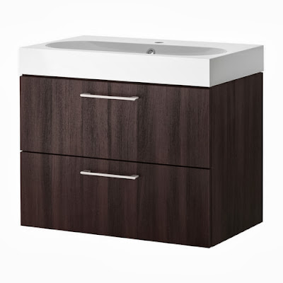
We're going to replace the vanity and have the entire floor retiled. We saw this Godmorgon vanity at Ikea and liked that it mounts to the wall so more of the floor is visible (making the room look larger).

Godmorgon Ikea vanity

We liked that it had drawers instead of the usual two-door set up, and the sink/vanity top is all one piece with plenty of flat surface space (the picture above shows the Braviken sink; we'll be getting the Odensvik). We may or may not replace the toilet - there isn't anything wrong with the one we have other than hard water stains - but that'll be something to decide at the end. They aren't that expensive, so it might be nice to have an entirely new room.

After what seems like too long talking about what we'd like to do, we decided that we would hire the work out. We know we can tile, we've done it before in our first house, but we don't have the time to do it properly. This year has been very hard with family illness, and we seem to only have a few hours a week of actual free time. A job that would take a contractor less than a week would probably take us months - just ask us about our kitchen. Plus it would be nice to know we have a guarantee/warranty if something were to go wrong (we're not plumbers, for sure!)

So, with all those decisions made we headed off to the tile store. Talk about overwhelming! So many choices and we had no idea what we wanted.  We saw plenty of tile that we kind of liked, but nothing that spoke to us, until we were nearly in the back corner of the showroom. We fell in love with this 8"x20" wall tile in a greyish beige called Splendida Turtle. (Even the name is perfect for us.)

Splendida Turtle 8x20 tile

Once we had that, the rest became much easier. It was awesome having a salesperson help us - she ran all over the room with our wall tile in her hands, comparing it to samples until we were happy. We decided on plank style tiles for the floor - they give the appearance of wood - and 2"x2" tiles for the floor.  This is what the floor tiles will look like, though we chose a shade lighter:


We brought home samples of each, just to make sure they would actually suit the room. Here they are all together. I like that the floor and wall tiles will be similar, though the floor tiles aren't as shiny and have a bit of roughness to them.


Now the next step is to hire a contractor. And order our tile!


Sep 13, 2013

Lighting: Take 1-2-3


Do you have a hard time choosing lighting for your home? I do. Almost every room in our house needs to have the lighting replaced, but when I wander through the stores I can't find a thing I like. Or it's more than I'm willing to pay. And then when I do finally pick something out, there's a good chance I'll change my mind about it in a few months.


Take our basement bar for example. You could start with the fact that I wish we didn't have a bar, but tearing it out and re-carpeting the entire basement is not in the plans. There are three pendant lights that hang down over the bar, and from the day we moved in we've had problems with them.


(Unfortunately, or fortunately, this is the only photo I have of them. That is not my bubble gum machine - nor my book on the Lotus.)

The middle light kept burning out. After replacing the bulb over and over, Tom discovered that there was a bad connection where the socket meets the bulb. He searched but he couldn't find a replacement socket for it.

So the hunt for new ones began. Neither of us could agree on a style, until we happened upon these ones by accident while shopping for something else at Rona (the Canadian version of Home Depot).

pendant light - Rona

We both kind of liked them. And they were pretty inexpensive. So we brought them home and installed them right away. You can extend them to about 3 feet, but because our basement ceiling is pretty low we kept them short: the shades were larger than the previous ones and no one wants a big light in their face.

But it wasn't to be. I knew right away that they were wrong. Again there was just that "something". I'm starting to think it was the brushed nickel finish. It was too sterile. The wood of the bar and the stair rail is a warm cherry shade and metal just didn't go.

pendant light - Rona

I was despairing that we would ever find something nice. Then I found the ones. These cut-glass mosaic style pendants were hanging out at Home Depot. Just minding their own business. The reddish tone coordinated perfectly with the bar, and the finish was black instead of nickel.

pendant light - mosaic glass - Home Depot

We hung them this past weekend and I'm in love. We ended up hanging them lower than the last ones - they look so much better that way. The description says the glass is brown, but when they're lit up the colour is definitely red. The wires still have a little kink to them, but they should straighten out with time.

Pretty, right? They give the room a warm, cozy feeling - kind of like a neighbourhood pub would have. If your neighbourhood pub had empty wine bottles and a box of Kleenex. Sounds about right, actually.

pendant light - mosaic glass - Home Depot

So sometimes you just have to keep trying until you find the right fit. Because once you do, you just know it.

pendant light - mosaic glass - Home Depot


Anyone want to buy some barely used brushed nickel pendant lights? 
I have several to choose from!

Sep 10, 2013

Refinished Deck Furniture


Now with the deck cleaned, we could get our outdoor furniture back out there. Yes, back out there. Over the summer I have been slowly stripping the wood, then staining and sealing it. I did all of the sanding on the deck, but once each piece was stripped I took it to the garage for refinishing. So the deck has been a bit empty for the last two months.

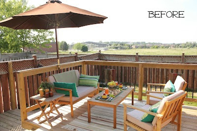
The furniture came in a honey/reddish tone with beige seat cushions.  Kind of bland and vanilla, but it did look nice when it was dressed up with pillows and throws.

deck furniture

That served us well for a couple of years, but the elements took their toll on the finish and it was starting to peel. The wood that was no longer sealed started to weather in an uneven way, so that we had grey patches mixed with the original honey colour. And a bit of mildew.


I booked a couple of vacation days and got to work removing all of the stain and whatnot. Lucky for me it ended up being two gorgeous days in the high twenties (Celsius) where I could work on my tan while I sanded the heck out of that furniture. I took each piece right down to raw wood. I even discovered that the top of the coffee table was cedar (as I tried unsuccessfully to remove the red tone. Duh!)


Here's my sleepy helper. She's not a fan of the noise. But she matches the Ridgid colours - new mascot perhaps?


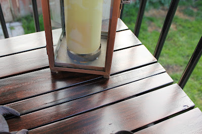
Once everything was completely sanded and wiped down, I stained each piece with two coats of Minwax stain in Red Mahogany. Just gorgeous. If these pieces were inside my house I would have just waxed them to a soft glow and let them be, but because they had to withstand our ever-changing weather, I needed to apply polyurethane. Three coats just to be safe.

With all those slats there was a lot of drip-through to the other side. By the time I got to the second piece I'd learned it was best to apply a coat to the underside, flip it over while wet, and then wipe off the drips on the top side. Then when you apply the poly to the top, you can wipe the drips underneath, but if you miss a couple it's no big deal because no one will see them. That's my theory anyway. And if you're that person looking under my furniture: just stop it right now.

refinished deck furniture

refinished deck furniture

Also, you'll get a smoother finish if you sand between coats with the highest grit paper you have. Some people are lucky and don't need to, but working in our garage, which isn't pristine, there were always a few rough spots from dust and/or bubbles. But if you sand after the first and second coats, your third coat should be nice and smooth.

refinished deck furniture

Along with the loveseat, chairs, and coffee table that came in a set, I also refinished the two side tables so that the entire area is cohesive. In fact, they are the same shade as the fold-down bar we made last year. How's that for tying things together? There is a method in my madness.

refinished deck furniture

The contrast between the wood and the cushions is much more noticeable now. It stops those big squares and rectangles of beige from looking blah and invisible. I replaced the green and blue accents from before with brown and orange. Cute little lumbar pillows, right? And it all coordinates with the umbrella now, which was kind of the odd man out before.

refinished deck furniture

I so dig the glossy look of the tables. And I'm not normally a fan of polyurethane - just check out my numerous other posts about waxing refinished furniture for proof. I watched the rain bead on the tabletop the other day and just smiled.

refinished deck furniture

refinished deck furniture

I set up the area with a little impromptu party - pickles, cheese, salami, etc. - and fizzy drinks of course. And then took a million artsy pictures of the glasses.

refinished deck furniture

refinished deck furniture

In fact, I took so long that the other three "people" living in the house decided to start the party without me.

refinished deck furniture

 But they're so cute, how could I be mad?


Cheers!


Related Posts Plugin for WordPress, Blogger...